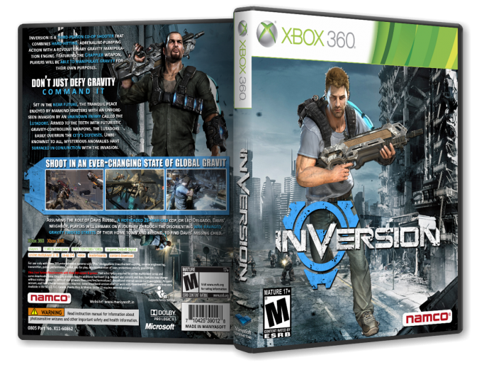
The back looks good, but I would have preferred that on the front there IS some kind of "inversion". Like placing the character on the wall or something. And the front render looks weird. He is oversized for the background, he looks pasted on (no shadow by his feet) and the hair is poorly cut out (I know that this is very hard).
But nevertheless you got my fav because of the cool back. I like that box for the screesnhots, too.
 Inversion Box Cover Comments
Very good.
[ Reply ]
Thanks.
[ Reply ]
The back looks good, but I would have preferred that on the front there IS some kind of "inversion". Like placing the character on the wall or something. And the front render looks weird. He is oversized for the background, he looks pasted on (no shadow by his feet) and the hair is poorly cut out (I know that this is very hard).
But nevertheless you got my fav because of the cool back. I like that box for the screesnhots, too.
[ Reply ]
Thanks for hints. I agree with you about poorly cut out. I'll try @ next work.
[ Reply ]
Thanks.
[ Reply ]