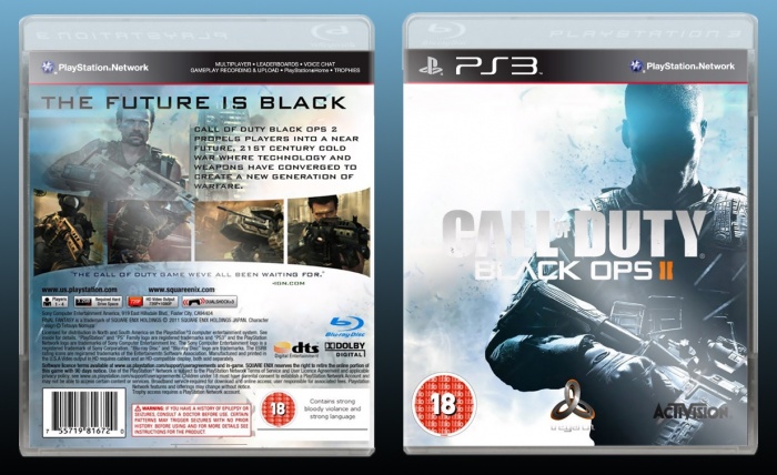
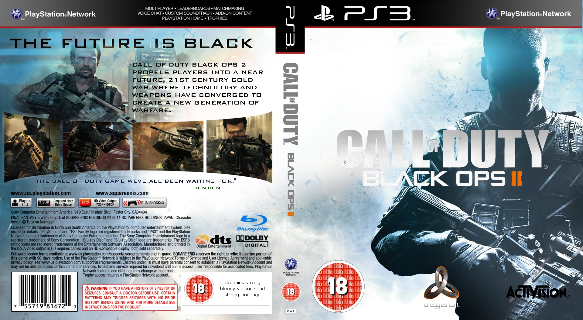
Its not bad, and it has potential. I suggest 3Ding your boxes to make them more attractive and give a professional look. I am content with the front, but the back can use work. Try making the tagline pop out from the rest of the text, and add a few things to the rest od the text like drop shadow, glow, etc.
i disagree on the point about the back needing work, I think it's near perfect, actually. I think the front could have something more, but not too much. this is a great box and i see you growing to surpass alot of people, but this is just my first impression
 Call Of Duty Black Ops 2 Box Cover Comments
Its not bad, and it has potential. I suggest 3Ding your boxes to make them more attractive and give a professional look. I am content with the front, but the back can use work. Try making the tagline pop out from the rest of the text, and add a few things to the rest od the text like drop shadow, glow, etc.
[ Reply ]
i disagree on the point about the back needing work, I think it's near perfect, actually. I think the front could have something more, but not too much. this is a great box and i see you growing to surpass alot of people, but this is just my first impression
[ Reply ]
@LordProctor what I meant by the back needing work was only the text visibility issue. Nothing more.
[ Reply ]
@Martiniii332 hahah, i agree on that part :p
[ Reply ]
You've got a lot of potential but the text on the back and the logo are a little hard to see. The screenshots could also use some borders around them.
[ Reply ]