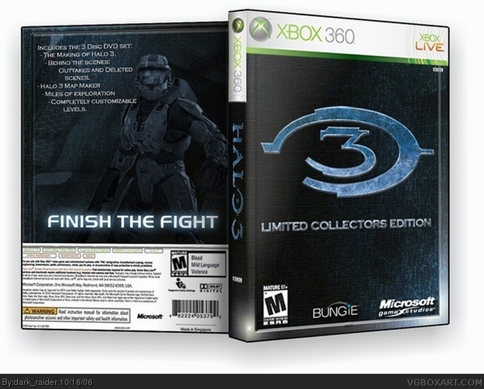
I know this looks a little similiar to the other one, but please dont try to compare the two...Comments and critiques and what not are welcome and appreciated. Just be fair...
#1, I was actually thinking it was similiar to the last 4 and its fair to account a lack of originality, when judging, even if it does'nt matter too much, as difference can affect the liking, of anything just as easily as it can affect the disliking. Personal prefernces and all that and for me this is nothing special but still good so 4/5.
Good box, wouldn't be surprised if this is similar to the eventual real boxart. The only thing keeping this from a 5 is the blur, and the blue tint. But it is still better than anything I could muster up! Because I think I am a much better artist on paper... (hey that's an idea! I could draw it, take a pic of it, crop/resize, insert into temp, submit!) Yeah, I think I'll try that, maybe go for a more graphic novel-ish feel. 4/5
 Halo 3 Limited Collector's Edition Box Cover Comments
I know this looks a little similiar to the other one, but please dont try to compare the two...Comments and critiques and what not are welcome and appreciated. Just be fair...
[ Reply ]
nice job and i like it!!!!!!!>....
[ Reply ]
It kiddin burry but it really cool .
4/5
[ Reply ]
thanx, I was trying to make it less blurry but Im impacient...and didnt feel like redoing it.
[ Reply ]
#1, I was actually thinking it was similiar to the last 4 and its fair to account a lack of originality, when judging, even if it does'nt matter too much, as difference can affect the liking, of anything just as easily as it can affect the disliking. Personal prefernces and all that and for me this is nothing special but still good so 4/5.
[ Reply ]
Quality: 4.5 it looks really good.
Originality: 2.5 it's been done before, just like all the other Halo 3 boxes.
Overall: 3.5 pretty cool, but like ratchet said, it's kinda blurry
[ Reply ]
I don't see anything wrong with it, but it seems like this is a popular style. Nice job on the descriptions, though.
[ Reply ]
thank you sacredtree
[ Reply ]
Good box, wouldn't be surprised if this is similar to the eventual real boxart. The only thing keeping this from a 5 is the blur, and the blue tint. But it is still better than anything I could muster up! Because I think I am a much better artist on paper... (hey that's an idea! I could draw it, take a pic of it, crop/resize, insert into temp, submit!) Yeah, I think I'll try that, maybe go for a more graphic novel-ish feel. 4/5
[ Reply ]