![]() »
»
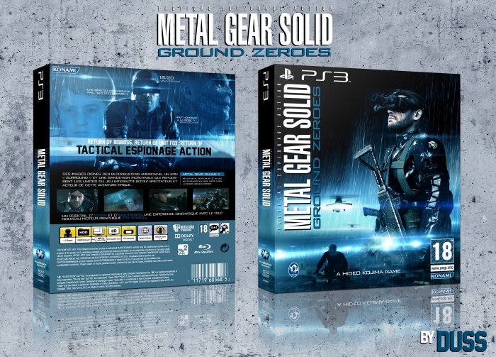
V2 of my future favorite game I think, "Ground Zero",Revised and corrected with the same elements what makes completely a different cover I believe, i hope you'll enjoy! :)
 Metal Gear Solid: Ground Zeroes Box Cover Comments
Comment on Duss's Metal Gear Solid: Ground Zeroes Box Art / Cover.
Overall this one looks better than the other one =) My fave, take it!
[ Reply ]
thank :)
[ Reply ]
Seems more like an update, but it works. Good job.
[ Reply ]
It is not false but I find that there is enough modification to make one v2, let us say that it is its slipcover :) Thank !
[ Reply ]
Great work..
[ Reply ]
thank :)
[ Reply ]
There is something that maybe you should change...the kojima productions and konami logo's are way too small and badly placed. Also the PEGI rating is on the wrong side =P
[ Reply ]
It is what I wanted for the logo PEGI and the logo KONAMI, but for KOJIMA, it is true that it is a little bit small but I did not want to take too much space, at first I did not even want to put him :)
[ Reply ]
Great layout overall and a beautiful blue/black color scheme :) The only small nitpick would be that the logo on the front, is a bit too close near the PS3 logo imo.
[ Reply ]
I made several tests and it was best I believe . Thank you.
[ Reply ]
Awesome.
[ Reply ]
Niceeee
[ Reply ]
My fave game :D , Nice cover
[ Reply ]