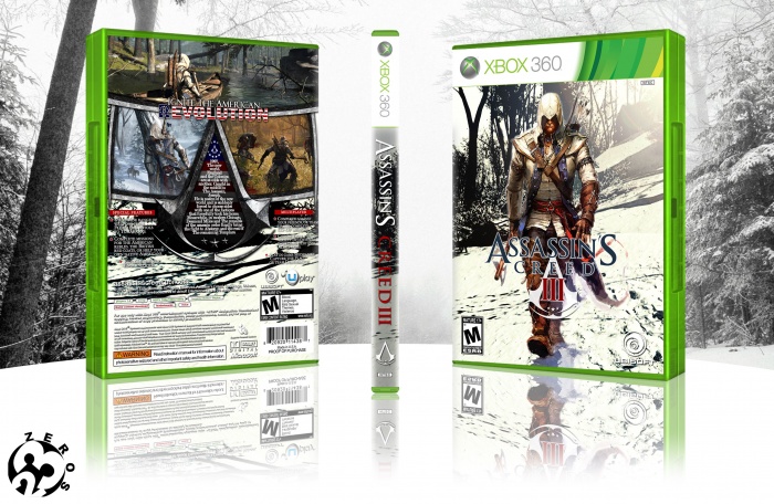
Here's my Assassin's Creed 3 box, I'm so excited about this game, a huge fan of Assassin's series, and I'm sure this'll be spectacular, It's only 20 days left to the lunch date, hope you guys like it. =)
EDITED: Here's the updated version, I tried to change some part of it as my dear friend Bastart just told me, It's better I believe!!:)
[ Box updated on October 13th, 2012 ] [ original ]
 Assassin's Creed 3 Box Cover Comments
Comment on 23-zeros's Assassin's Creed 3 Box Art / Cover.
Cool..
[ Reply ]
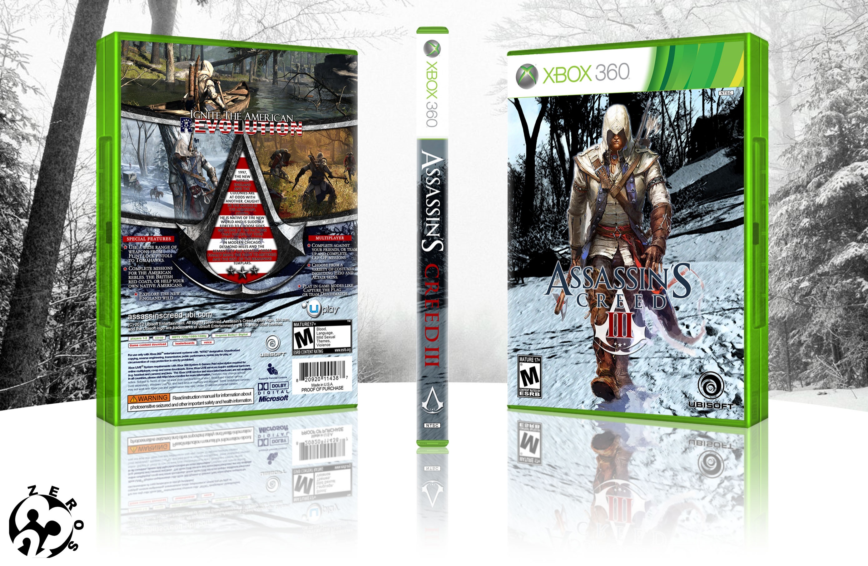
The artwork on the front could be merged a bit smoother imo. (in terms of lightning and contrast with the background layer) and the text in the AC insignia on the back of the box is kinda hard too read imo. (mainly caused by the red/white stripes of the flag underneath it)
The rest looks really great! (I especially like the layout you've chosen for the back and what you've tried to achieve with the artwork on the front of the box.
[ Reply ]
man thank you so much,your words mean so much to me, tnx:)
you're right, you're like a master to me, and I'd absolutely listen to what you'd say and try to fix it, I'm not a pro like you guys here, but I'm trying to learn, I really adore this art.
What'd you suggest Bastart instead of the flag? should I lower the opacity or change it with something else?
for the front I'd merge it to the background and will update it as soon as It's finished!
[ Reply ]
Not bad. The text on the back is hard to read though.
[ Reply ]
tnx guys, your so nice.
[ Reply ]
here's the updated version, I tried to do as my dear friend Bastart just told me, hope It's better!
[ Reply ]
The text is much better, but I'd suggest to not use capitals on the entire info, it's not very pleasing to the eye, you know? as for the front, the upper half of the forest in the background could be lighter, so the gradient from dark (below) to light (above) is seen on both images, if you get what I mean? at the moment Connor's upper half is way lighter than the trees behind him and there's no real light source coming from anywhere? Try to add a lens flare from the sun or just make the gradient from dark too light more obvious.
[ Reply ]
thank you so much Bastart, I'd really appreciate it, I did all I could to change it as you said, what do you think? please feel free to let me know your thoughts.
P.S. I didn't know if you'd like me not to use the capitals on the sides of insignia too or not, please let me know which one is better! that's why It's unchanged.
[ Reply ]
Looks much better!
[ Reply ]
thanks:)
[ Reply ]
Nice
[ Reply ]
thank you man:)
[ Reply ]
The front looks so much better, great job ;) and the synopsis is much easier to the eyes, but to be honest the color scheme of the box feels out of place after the change :/ (if you'd compare the front with the much darker spine and back) I've also noticed a small typo 'Compete' against your friends instead of 'Complete'
[ Reply ]
thank you so much Bastart, you're so kind for giving me your thoughts, you are the reason for this so It's better:)
I know what you mean, I'm going to fix it, actually I used winter like color scheme for the front and It also went to the back, but I used dark to light gradient to make the txt more visible! I'm going to keep the winter color scheme and take that dark side of the back and update it again, please feel free to give me your thoughts.
[ Reply ]
here's the updated version, what do you think Bastart?
I thought It'd be better to use warm colors on the Connor instead of that cold look, I removed the dark lighting on the back as you said:)
I've also changed a lil bit of back side!
[ Reply ]
Yeah, definitely much better ;) the spine doesn't really match, but that's not a big issue. I'm glad you decided to change it up a bit, it's improved a lot :)
[ Reply ]
@Bastart thanks pal, you've been a great help to me, I've learnt a lot, I will do my best to make better boxarts from now on.
[ Reply ]
Amazing , o_O
[ Reply ]
tnx man:)
[ Reply ]
this may be a stupid question, but who the heck is Joseph?
[ Reply ]
Thayendanegea or Joseph Brant (March 1743 – 24 November 1807) was a Mohawk military and political leader, based in present-day New York, who was closely associated with Great Britain during and after the American Revolution. Perhaps the American Indian of his generation best known to the Americans and British, he met many of the most significant Anglo-American people of the age, including both George Washington and King George III.
[ Reply ]