The logo isn't very clear (especially the lower left part of the logo) so I'd suggest to add a light drop shadow. The box also could benefit by adding a back. It's really not that bad for a first, I like you've tried something different (in terms of the usual angle they show off cars on covers of race games) to make it stand out more.
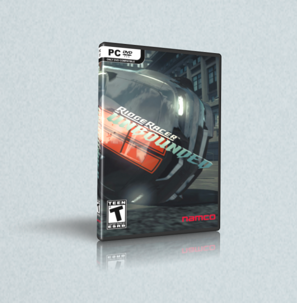
 Ridge Racer Unbounded Box Cover Comments
The logo isn't very clear (especially the lower left part of the logo) so I'd suggest to add a light drop shadow. The box also could benefit by adding a back. It's really not that bad for a first, I like you've tried something different (in terms of the usual angle they show off cars on covers of race games) to make it stand out more.
[ Reply ]