![]() »
»
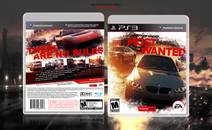
New year - new box. :)
Wanted to go for a sunny and vibrant color scheme for this particular game and cover.
Big thanks to those that helped me out in the WIP thread, especially Deividas, Bastart, Martiniii332 and Higashi89.
As always, view full size for best quality.
Comments and favorites are much appreciated.
 Need For Speed : Most Wanted Box Cover Comments
Comment on deiviuxs's Need For Speed : Most Wanted Box Art / Cover.
Great design my friend, and congrats on this being the first box of 2013 haha. The grunge texture works well with this game in my opinion, and I love the redesign on the back as shown in the forums. Fantastic.
[ Reply ]
Turned out quite nice.
[ Reply ]
This turned out great :)
[ Reply ]
Great work.
[ Reply ]
Nice job.
[ Reply ]
So awesome!
[ Reply ]
Amazing.
[ Reply ]
Just one thing though: I can barely see the left side's reflection.
[ Reply ]
Despite the fact the "Need for Speed" part of the logo is hard to read everything suits well on the composition of this box, the colors are strong and blends well with the "snow border" which spotlights the whole box.
[ Reply ]
It looks bitchin. But a NFS game that's rated M? WTF???
[ Reply ]
Just love that hint of orange on the front of the box. Great design all together, well done.
[ Reply ]
The overall design is great, however, I think the white borders feels out of place and strange, especially on the front.
[ Reply ]
It's strange. I would think that the front should look off because it's so asymettrical, and everything is on the right hand side. But it looks good. what.
I guess the tagline is right, there are no rules! haha!
[ Reply ]
This should pretty much been in HoF right now imho.
[ Reply ]
I think it would be cool if the car on the front wasn't cut off by the white at the bottom. Also, I'm not sure the slick look of the text goes with the grungy look of everything else.
[ Reply ]
Dammit, missed that one. Fantastic.
[ Reply ]
Sweet. Thanks for the Hall guys!
[ Reply ]
Really nice, love this box. My only suggestion would be to try doing something to the text to make it more visible/stand out more. It looks kinda slapped on there on the back. Maybe add a drop shadow?
[ Reply ]
If you're referring to the tagline, then I tried to match it to logo which doesn't have a drop shadow. I wanted text to be "part of the picture".
[ Reply ]
Great use of grunge brushes! +Fav
[ Reply ]
Great Box ;)
[ Reply ]