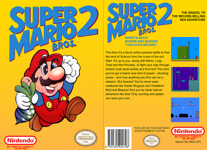
My first ever attempt.
The Super Mario Bros 2 box in the style of SMB3.
- Turnip Mario lifted from a SMB USA (japan) promo poster
- "Super Mario Bros." logo lifted from the SMB3 box.
- Nintendo and seal of quality vectors lifted from wikipedia.
- Fonts used: Arial, nes-like (Fonts2u.com), Myriad.
- Bar code vector: from www.vecteezy.com
Once I am a bit established on this site, I hope to be able to
look back and laugh at this first entry.
 Super Mario Bros 2 Box Cover Comments
Comment on tigris's Super Mario Bros 2 Box Art / Cover.
Not too bad for a first.
[ Reply ]
Awesome!
[ Reply ]
Not too shabby for the first time mate :)
So here's my two cents:
1. Missing spine
2. Logos out of proportions (stretched)
3. We have a SMB2 logos, should have checked, fonts aren't sharp
4. Screenshots could've use some nice frames, to accentuate them
... but BIG props on Mario character. Would you be kind enough to point us to the source file? I'd love to get one.
Please do not be discouraged by my critique. I hope your next cover will be much better. Good luck :)
[ Reply ]
Thank you for this good feedback.
The SMB3 logo comes from a scanned box, I removed the number 3 and added a number 2 (the sharp bit). I'll work on the other points.
I'll privmsg you the Mario source file when I'm home tomorrow.
[ Reply ]
@tigris
I will be grateful for the file and if I use it, I'll definitely give you credits.
One more thing, your cover is backwards :P You should have back cover on the left side and front cove on the right side.
I've seen some poor first time covers, but you look like are on the right track to be a good cover designer :)
[ Reply ]