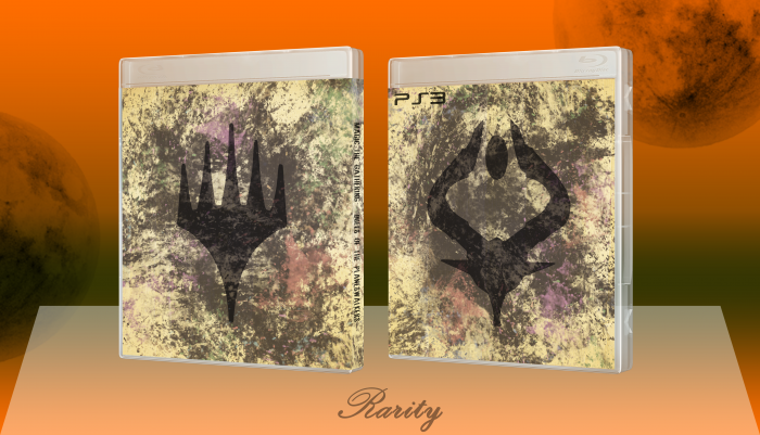
Alright, my take at a simple, almost minimalistic box.
What I'd like to point out is that everything except the fonts in this box are custom. Traced the shapes from some screen captures, the texture came from a photo and the brush set as well. Time one would normally spend on the box it self I spend on creating some one-of-a-kind resources now.
Font of PS3 - PhatBoySlim
Font on Spine - Sombody to love (yes without an E)
Creds to mark_inou for the case temp.
Just let me know what you guys think :)
As always - high res printable available!
 Duels of the Planeswalkers Box Cover Comments
Comment on Rarity's Duels of the Planeswalkers Box Art / Cover.
My one main issue with all these boxes, disregarding the lack of info on the back (special editions I can understand), but there is no ESRB or developer logo on the FRONT which is what tells a person what it's like. "Konami" and "Mature?" So is Metal Gear Solid...
Regardless, it's still a lovely box.
[ Reply ]
The grunge that is on this design looks really unnatural, but the concept is really good. I would work on the coloring and trying to integrate the grunge better into the design.
[ Reply ]