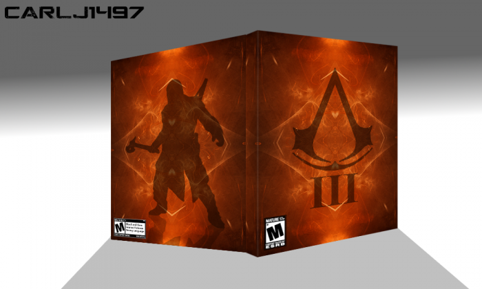
Yeah so I think all of my boxes from now on will be minimalism art.
[ Box updated on February 10th, 2013 ] [ original ]
 Assassin's Creed 3 Box Cover Comments
Comment on Carlj1497's Assassin's Creed 3 Box Art / Cover.
Connor's reflection should have less opacity that it has.
[ Reply ]
Thanks Ergo, just updated it.
[ Reply ]
@Carlj1497 still too much imo.. Btw, dont restrict yourself, boundries decrease creativity..
[ Reply ]
@Rarity All right. I updated it (again lol). The logo on the front and Conner are set at 50% opacity. Connor's shadow is at 25% opacity.
[ Reply ]
@Carlj1497 looks alot better :) would you mind putting some gaussian blur on the shadow as well? Makes it more realistic.. Ps. As I think your eager to improve from your critics, as you already updated twice on two comments, make sure to use the WIP forums with your next box
[ Reply ]
I want this cover haha
[ Reply ]