I really tend to watch a lot of TV shows, yet there are just a few I really watch every week. So it's fair to say this is one of my current favourite TV shows so figured I'd make a box for it.
Credits:
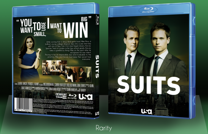
Blu-ray case by Mark-Inou
Renders came from USA network wallpapers
Logo the same
Skyline and sky came from sxc
Synopsis was addepted by the one USA network wrote on their site.
Quote came from Harvey Specter somewhere in the first season I believe.
Just let me know what you guys think!
As always 300dpi printable available.
 Suits Box Cover Comments
Comment on Rarity's Suits Box Art / Cover.
Nice Job Rarity . . . (â—Žoâ—Ž)
[ Reply ]
Cheers!
[ Reply ]
Pretty good. I like the colour scheme.
[ Reply ]
Ty, the colour scheme for the sky was pretty much the base for this image, I coloured the sky first and adjusted the rest accordingly, so I'm really happy you like that part as it really was the purpose of this design.
[ Reply ]
Nice one , like it , o_O
[ Reply ]
Thnx!
[ Reply ]
What I like about you as an artist is that you use renders instead of straight out wallpapers. Nice cover too.
[ Reply ]
Thanks, on both accounts. On the first point; I usually have an idea in my head on how I want a box to come out, then I start collecting resources. What I mean is it's kinda my way of designing that enforces me to use renders.. It's nice to know the extra effort of rendering is appreciated though, so thanks again.
[ Reply ]
You want to small lose, I want to win
I can barely read the typography the first time I read this. Overall, it's well composed, though.
Also Rarity looks fucking pissed.
[ Reply ]
Nice Cover . I had asked my friend. I wanted to see if it is possible to see the cover and tell me what my problem is .
vgboxart.com/view/50170/a-good-day-to-die-hard-cover/
[ Reply ]
Nice, I love the colors. The arrangement on the back could use some work, it seems a little awkward as it is. Also the tagline is very difficult to read, maybe some easier-to-read typography could be used :P
Still, this box is excellent. It really deserves a spot in the Hall.
[ Reply ]
Pretty neat box. I think the typography on the tagline on the back could be better but overall a very clean and well executed design.
[ Reply ]
That show sounds funny, I definitely should watch it some day.
[ Reply ]