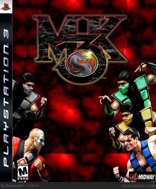
Ok this one took awhile but its finslly ready . Mortal Kombat 3 is one of my favorite MK games so i made a cover for it. credit to cmt for the template
Post a thread. We need to help you with your boxes, and the best way to do that is via the forum. I will look up some photoshop tutorials for you to go through and learn from. There is this one that WickedGamer1 showed me that helped me with blending.

 Mortal Kombat 3 Box Cover Comments
Ok this one took awhile but its finslly ready . Mortal Kombat 3 is one of my favorite MK games so i made a cover for it. credit to cmt for the template
[ Reply ]
Background is boring, but the characters, it seems, have been cut out correctly. You might want to change the background to something from the game.
Nice job with the game logo. Nice and clean. The Dev logo is not cut out and is too small, and the ESRB logo is to small.
[ Reply ]
its ok... its boring (too much red in the background and its distracting) ...midway needs to be cut, m logo is a lil too small enlarge it, a little
2/5
[ Reply ]
I have trouble cuting things out because i dont like photoshop or GIMP i use paint. you know its on almost any computer
[ Reply ]
alright boxart. it wourld be cool if they remade mk3 and put it on the ps3!
[ Reply ]
I think i should take out noob saibot (the black guy) becuase hes kinda hard to see does anyone agree
[ Reply ]
Ok i enlarged the esrb logo made a mortal kombat 3 background and cut out the midway logo
[ Reply ]
I never noticed that black guy!
Its still a bit dull, and the midway logo is squashed.
Hold shift when your enlarging to make it keep its normal proportions.
3/5
[ Reply ]
You are improvmenting but it still needs work
1. The midway logo is to small and squashed.
2. the Background still borning
2.5/5
[ Reply ]
Ok i made a more interesting bg and put in more characters
[ Reply ]
It better but you made the midway logo even smaller .
[ Reply ]
Put more action into it. This is a fighting game, correct? Yet these people are just standing at the sides.
Background is still a bit dull.
[ Reply ]
Post a thread. We need to help you with your boxes, and the best way to do that is via the forum. I will look up some photoshop tutorials for you to go through and learn from. There is this one that WickedGamer1 showed me that helped me with blending.
[ Reply ]