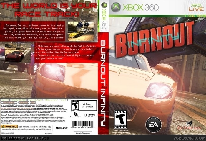
For some reason, the slogan on the back became blurry??? anyways, it has been officially anouned that burnout 5 will have a complete city for you to go around in. And, since i like the word infinity, i made another one to celebrate my dream coming true (i think they saw my post and thought it was a good idea) :P
looks alright, I think you should fix the Infinity logo though, seems kinda plain for a burnout game. I give it a 4, but if you change the logo ill boost your score higher.
#9, me and my spelling errors :P
anyways, thanx Werdney. But the problem with the back text (the big slogan really) is that in GIMP and in the .PNG format i bring it up in, it looks great, but uploading it here just makes it look bad :(
 Burnout: Infinity Box Cover Comments
For some reason, the slogan on the back became blurry??? anyways, it has been officially anouned that burnout 5 will have a complete city for you to go around in. And, since i like the word infinity, i made another one to celebrate my dream coming true (i think they saw my post and thought it was a good idea) :P
[ Reply ]
well the frunt still look awsome but the back since it got blurry puts you down be .5 in grade sorry
still sound like a awsome game
[ Reply ]
looks alright, I think you should fix the Infinity logo though, seems kinda plain for a burnout game. I give it a 4, but if you change the logo ill boost your score higher.
[ Reply ]
thanx guys. I'll play around with the logo and see what's causng the blurryness on the back.
[ Reply ]
It O.K but this not your best .
4/5
[ Reply ]
#5, thanx i suppose... (i'm getting worse as the days go by) :(
[ Reply ]
I really like it, it is stylish and has cool colors.
The caption on the back is a little fat though.
4.5/5.
[ Reply ]
#7, thanx general :)
somethings wrong with the text on the back, i have had that happen a lot lately.
[ Reply ]
I think the text on the back is fine, and I like the branching pic and the spine. You spelled violence wrong on the back. 4.5/5
[ Reply ]
#9, me and my spelling errors :P
anyways, thanx Werdney. But the problem with the back text (the big slogan really) is that in GIMP and in the .PNG format i bring it up in, it looks great, but uploading it here just makes it look bad :(
[ Reply ]