agh! again with the bad text... i don't know, it looks great when it isn't submited, it even looked fine in the forums... anyways, i hope you like this. Took about 3 days to make.
kewl box RB I still don't understand why you don't use IMANDIX it would look great in 3D. 4.5/5 cause the Sierra and monolith logo are a bit choppy in full view
#5, well, everything gets distorted in 3D, besides, i worked hard on this box, i don't want people to get a side view of the back, that defeats the purpose of making a back! but thanx for the vote.
i figured how to make the logo...first type in F.E.A.R. and add a motion blur, then type FEAR (without the dots) and then overlay it over the blurred text...I was looking closely at the real logo and figured out how to do it...I hope that helps.
thats the thing I dont have a font that really works with it, but you could probably try dafont.com they might have the FEAR font or something similiar...thats where I get most of my font.
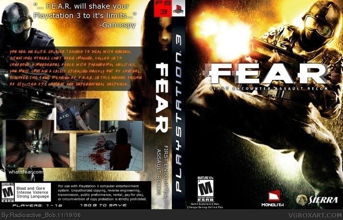
 F.E.A.R. Box Cover Comments
agh! again with the bad text... i don't know, it looks great when it isn't submited, it even looked fine in the forums... anyways, i hope you like this. Took about 3 days to make.
[ Reply ]
finaly you upload it
awesome box 5/5
[ Reply ]
#2, i had to make sure it was good. thanx for the vote :)
[ Reply ]
#1, don't blame yourself blame REED lol XD when you upload a box it turns its qualtiy badly down god i hate that
[ Reply ]
kewl box RB I still don't understand why you don't use IMANDIX it would look great in 3D. 4.5/5 cause the Sierra and monolith logo are a bit choppy in full view
[ Reply ]
#5, well, everything gets distorted in 3D, besides, i worked hard on this box, i don't want people to get a side view of the back, that defeats the purpose of making a back! but thanx for the vote.
[ Reply ]
radioactive bob excels at boxmaking again!
*thinks*
The Adventures of Radioactive Bob!! (superhero music) on a mission to stop all bad boxartists!!!
LOL!!!!! that would be so cool. maybe electric general or treesquirel or someone else could be your sidekick.
to the box, it's just..... you know, great. What you expect from RB. ^_^ 4.5/5
[ Reply ]
#7, hahaha....... no
[ Reply ]
#7, i expected a cookie... chocolate chip...
#8, hahaha...yes! and my DOG will be my sidekick!
thanx for the comments guys.
[ Reply ]
#7, uh... maybe that was a bit stupid.... maybe it wasnt THAT funny. i admit, but still, that would be kinda cool.
[ Reply ]
#10, it wasn't stupid, it was...creative...to say the least... :P
[ Reply ]
Well done bob .
4.5/5
[ Reply ]
Thanx Ratchet :)
[ Reply ]
The orange text on the back should've been white and plain with a black outline to match up to the rest of the box.
Very cool 4.5 could be cooler.
[ Reply ]
thanx General, i'll play around with the text to see what i can do. :)
[ Reply ]
the only thing I see wrong is the fear logo its missing the dots...FEAR needs to be F.E.A.R. still a great box 4.5
[ Reply ]
P.S. the logo doesnt have enough motion blur...
[ Reply ]
#16, i had to improvise, i will try and get the dots back in though, thanx :)
[ Reply ]
i figured how to make the logo...first type in F.E.A.R. and add a motion blur, then type FEAR (without the dots) and then overlay it over the blurred text...I was looking closely at the real logo and figured out how to do it...I hope that helps.
[ Reply ]
#19, that really helps, thanx. but what font would i use?
[ Reply ]
thats the thing I dont have a font that really works with it, but you could probably try dafont.com they might have the FEAR font or something similiar...thats where I get most of my font.
[ Reply ]
R BoB check you FEAR forum for the logo...I decided I would try to make it and I think it came out pretty good...There is a Jpeg and a PSD. file.
[ Reply ]
#22, saw it, thanx :)
[ Reply ]
Can you make this printable?
[ Reply ]