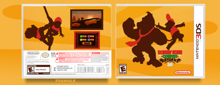
I actually quite like it, but I think it could benefit from a sort of footholding on the front. Looks like they're just floating there./ Great job, otherwise, though.
I like the design in alot of ways. Reminds me of KoopaDasher's DKC2 box. I agree with Static, also. I don't like the logo's positioning.
The back on the other hand needs an entire rework. The design doesn't make alot of sense for starters. It feels really unbalanced. I would either put some text in or make it art-oriented and remove the screenshots for more images of the main render's environment. And I know you said not to look, but thats no real excuse, the fullscreen is atrocious. The render is really, really choppy.
Not a big fan of the presentation either, just because it makes the box look transparent haha, its the exact same as the box's background!
 Donkey Kong Country Returns 3D Box Cover Comments
I actually quite like it, but I think it could benefit from a sort of footholding on the front. Looks like they're just floating there./ Great job, otherwise, though.
[ Reply ]
Let's say DK is standing on the orange line.
[ Reply ]
I like the front, it's really good. But the back's kinda plain.
[ Reply ]
I like the design in alot of ways. Reminds me of KoopaDasher's DKC2 box. I agree with Static, also. I don't like the logo's positioning.
The back on the other hand needs an entire rework. The design doesn't make alot of sense for starters. It feels really unbalanced. I would either put some text in or make it art-oriented and remove the screenshots for more images of the main render's environment. And I know you said not to look, but thats no real excuse, the fullscreen is atrocious. The render is really, really choppy.
Not a big fan of the presentation either, just because it makes the box look transparent haha, its the exact same as the box's background!
But you definitely have potential. :)
[ Reply ]
I just dont like ho the Logo is. You can barely read it
[ Reply ]