
Credits to eggboy for the box template and mark_inou for the disc template.High res: link Thanks to everyone who helped in the wip, the box wouldnt have gotten far without your help :)
[ Box updated on July 26th, 2013 ] [ original ]
 Saving Private Ryan Box Cover Comments
Comment on Deathmania's Saving Private Ryan Box Art / Cover.
I have to admit that it looks terrible in full view, but the preview is pretty awesome, as well as the design. Good job.
[ Reply ]
Thanks :) And did you try the high-res?
[ Reply ]
@Deathmania It's better in high-res, but the resolution of the texture is still compromised.
[ Reply ]
Have to agree with 332 about the quality in full, and high res. The textures look quite bad but the design itself is pretty great.
[ Reply ]
Hmm... The thing is that everytime I do a high-resolution box, in the end I have to make the resolution around 2000x3000, the reason being that I am unable to upload jpg images, and that res gets my about 7-8 mb as a png. So this time I thought I will start off at that res, then half way through I realized its not gonna do it, so I increased the image size(I thought it would look better since most of the layers had effects on them that look better when there is a higher image size). I guess doing that improved the the overlay(text, title, medal lines etc.) but not the initial textures. So my apologies for that next time I will be sure to start with a higher res.
tldr: I messed up on the res, but I will make sure it doesnt happen next time.
[ Reply ]
I really love the complete feel of this. The only thing I'm going to end up nitpicking because I didn't notice before is the text in the back "kissing" the edges of the box. Some breather room would have been nice. This goes for the info in the center and the reviews (which can just be nudged a light more towards the middle).
Overall though, I really love the way this turned out from where you started!
[ Reply ]
It wouldnt have come out this good without your help :) And the text should be easy to fix cause its not the actual box thats doing that, its just that some of the back is under the plastic so that is making the text look too close to the edge. I will update it tomorrow :)
[ Reply ]
Now I'm actually thinking about watching this movie.
[ Reply ]
Glad I could influence someone :) And thanks for your help in the forums, I highly appreciate it.
[ Reply ]
A sharper version would quite improve the look of the overall box, but the design itself is just really creative and eye-catchy ;)
[ Reply ]
Yea I really messed up on the start resolution of this box :l I will keep in mind to make it higher on my next box. Also thanks for your help at the forums :)
[ Reply ]
Wow this is very nice! Good job :)
[ Reply ]
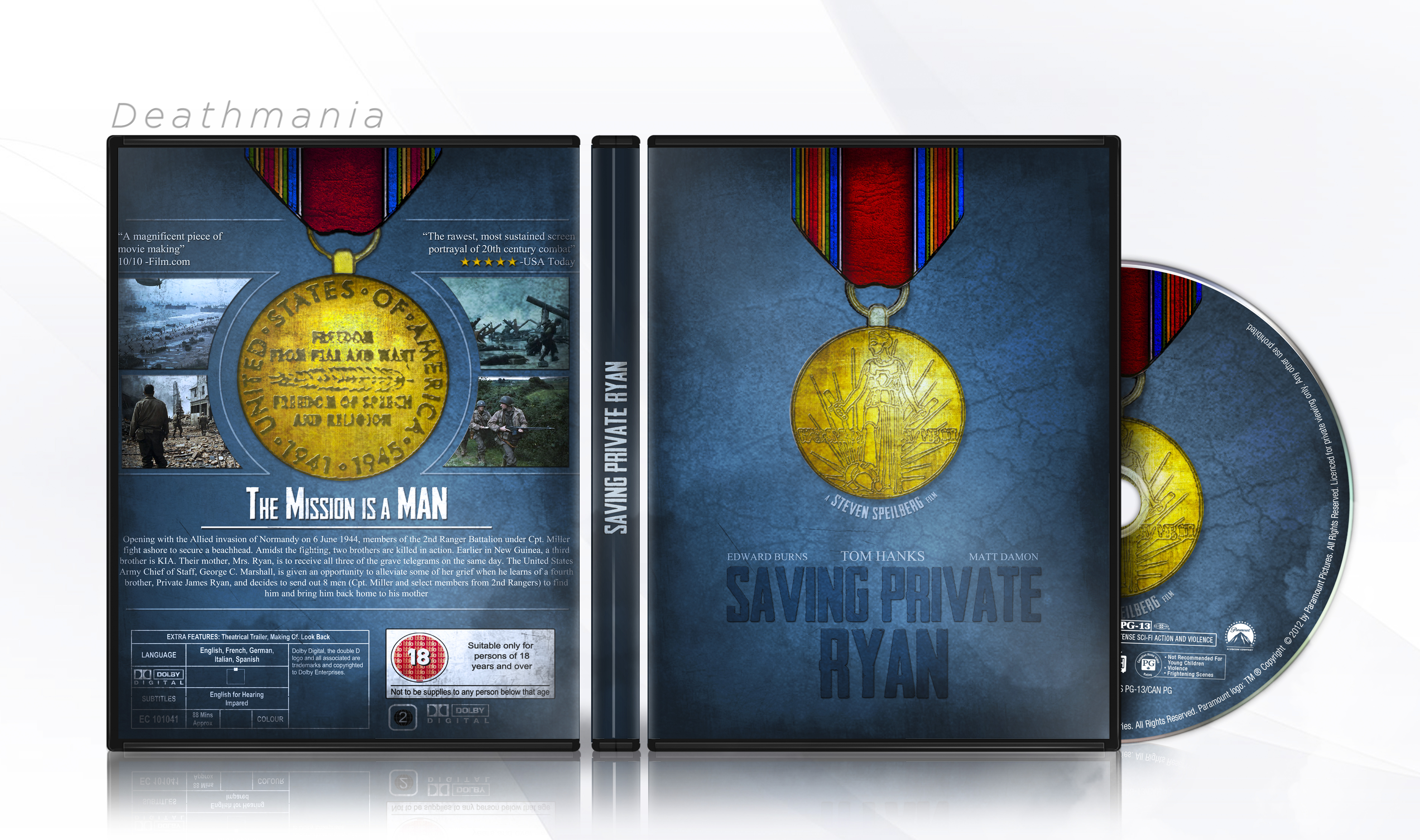
Steven Speilberg? Hmmm....
Not sure about 2 times the medal... I think one medal would have sufficed.
[ Reply ]
Well I wanted to do a front and back of the u.s. victory medal from world war II
[ Reply ]
I'm stil waiting for this (along with a few other covers of yours) to get into the HoF.
[ Reply ]
Wow thanks, I missed this comment :p
[ Reply ]