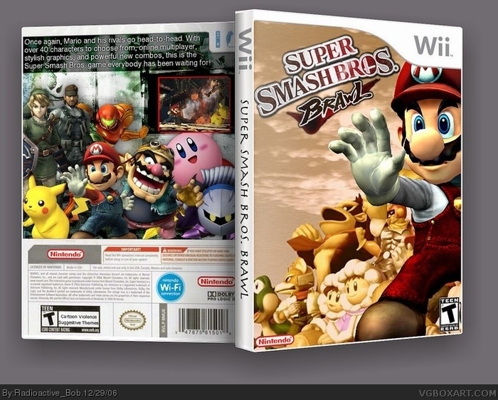
The 3-D Effects are extremely well done, and the back is hella'-realistic. The side isin't much to my liking, kind of plain, but that's no major fault.
Thanks guys. but General, I wanted only one screen because with already many characters on the back, there wasn't enough room for another screen, or else there would be helluva lot going on. But thanks still. :)
#12, I'm sure you could've just covered up Pikachu or Meta Knight.
I'd personally rather have one more screenshot
or two than more characters when there's allready a few.
yeah that's right. i tried a smah bros box before but there is absoultely zilch material, and the character art kinda sucks (it's hard to cut out and stuff)
the most anticipated game for Wii and this to show for it? I'm sorry, but I don't like it at all really. Mario is covering a majority of the characters and it's really distracting. Everything faded into the background doesn't do justice for me either. On the original cover everything is in detail.. all the characters-- because they don't want to focus on just one. Also, if you were going to use this art for your cover, why would you cut off yoshi's nose? either delete him from the pic or incorporate his nose. I also really don't like the slant of the words " Super smash Bros. Brawl" because slants are typically used to direct the viewers eye to something else. In this case, the words direct the viewers eye to nothing.. oh wait it directs it to the "Wii" in the top corner, but everyone knows that this game is for Wii so that's unneccessary. Now the back. The back, with regards to the characters and the layout of them is actually better than the front. It would actually have been better if you put the characters from the back, on the front instead. Also I don't really like that you have both clumps of characters on both sides. You flip a game over to read about it, not look at the same thing from the front. Also, you have ONE screenshot and barely a paragraph and terrible font to describe this game.. Would you buy a game with that description and one screenshot.. knowing nothing about the game? I wouldn't. More words, more screenshots, less copying from front to back.
( please don't take this as an attack to your design, but just a critique :) )
 Super Smash Bros. Brawl Box Cover Comments
Yay! My first box posted up in 3D. Of course, it wouldn't be possible without Deathspawn, so props go out to him. ;)
Anyways, I hope you like this. :)
[ Reply ]
YAY ME! :p
4/5
[ Reply ]
Thank you, come again. :)
[ Reply ]
Nic Work bob 4/5
[ Reply ]
Thanks MuffinKiller. :)
[ Reply ]
Freakin sweet. Gosh! 5/51 Gosh!
[ Reply ]
Not. MAKE that 5/999 or 5/0. NO! Let's just keep it at 5/5. ;)
[ Reply ]
very nice. i like the feel of the front cover. im not crazy about the back but nice overall. 4/5 keep up the good work.
[ Reply ]
That's one HELL of a box art, my friend.
The 3-D Effects are extremely well done, and the back is hella'-realistic. The side isin't much to my liking, kind of plain, but that's no major fault.
Overall secksiness : 5\5.
[ Reply ]
#9, thx :D (I did the 3d)
[ Reply ]
This is really good but only one screenshot doesn't
totally do it for me.
4/5.
[ Reply ]
Thanks guys. but General, I wanted only one screen because with already many characters on the back, there wasn't enough room for another screen, or else there would be helluva lot going on. But thanks still. :)
[ Reply ]
#12, I'm sure you could've just covered up Pikachu or Meta Knight.
I'd personally rather have one more screenshot
or two than more characters when there's allready a few.
[ Reply ]
#13, I'll try adding a screen below the present one. Maybe move other things around. I'll update if it looks good. ;)
[ Reply ]
Where you get that box base?? I really need that one...
[ Reply ]
#15, i got it from the forums. You wouldn't believe the stuff you can find there.
[ Reply ]
This IMO is your best box art.
[ Reply ]
Thanks Ricardo :)
It's the 3D isn't it?
Everybody wants 3D now! :P
just kidding.
[ Reply ]
I like.
5/5
[ Reply ]
i like a lot.
6/5
[ Reply ]
but we all know there's a ssb melee pic on the front
[ Reply ]
#21, all the materiel has been used before, I had to improvise.
[ Reply ]
yeah that's right. i tried a smah bros box before but there is absoultely zilch material, and the character art kinda sucks (it's hard to cut out and stuff)
[ Reply ]
Great! one request. Take off ice climbers. there being removed from the series. same with mr. gandw
[ Reply ]
#24, even though this is great, DON'T BUMP OLD BOXES. Please. It really f's up the front page of the site.
[ Reply ]
the most anticipated game for Wii and this to show for it? I'm sorry, but I don't like it at all really. Mario is covering a majority of the characters and it's really distracting. Everything faded into the background doesn't do justice for me either. On the original cover everything is in detail.. all the characters-- because they don't want to focus on just one. Also, if you were going to use this art for your cover, why would you cut off yoshi's nose? either delete him from the pic or incorporate his nose. I also really don't like the slant of the words " Super smash Bros. Brawl" because slants are typically used to direct the viewers eye to something else. In this case, the words direct the viewers eye to nothing.. oh wait it directs it to the "Wii" in the top corner, but everyone knows that this game is for Wii so that's unneccessary. Now the back. The back, with regards to the characters and the layout of them is actually better than the front. It would actually have been better if you put the characters from the back, on the front instead. Also I don't really like that you have both clumps of characters on both sides. You flip a game over to read about it, not look at the same thing from the front. Also, you have ONE screenshot and barely a paragraph and terrible font to describe this game.. Would you buy a game with that description and one screenshot.. knowing nothing about the game? I wouldn't. More words, more screenshots, less copying from front to back.
( please don't take this as an attack to your design, but just a critique :) )
[ Reply ]
The front is very original.
The back, boring text and
no game pictures.
3/5.
[ Reply ]