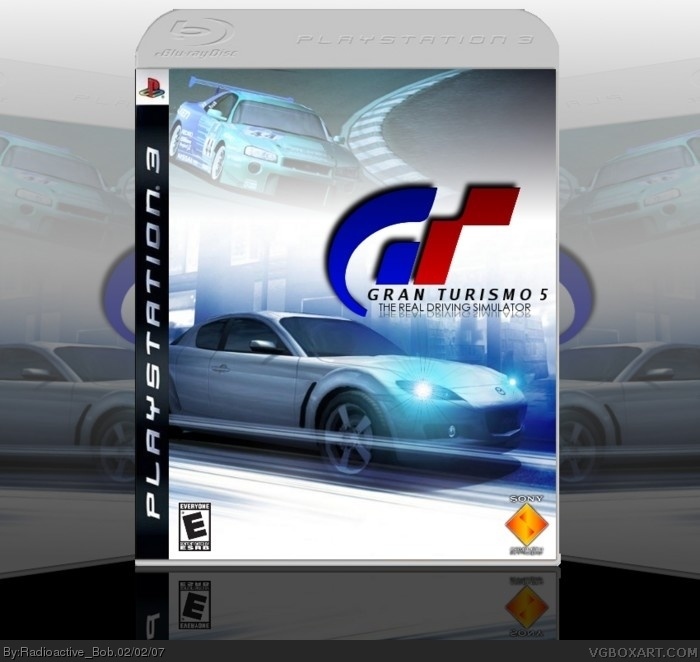
Much, much better in full view.
Anyways, credit to Lodovicok for his template.
Well, i'm not going into some big, long speech for this, I made it about 2 days ago, and now it's done. :)
I was thinking of changing the logo to look more like the standard ones, but I wanted it to look different. Since all developers change the logo eventually, I wanted to try changing it my way. If that makes any sense. =/
#18, hey Ratchet, have you noticed that whenever you post on one of my boxes, it stops all further comments...Your like the Final Verdict Guy. :P
i just noticed that...
 Gran Turismo 5 Box Cover Comments
Much, much better in full view.
Anyways, credit to Lodovicok for his template.
Well, i'm not going into some big, long speech for this, I made it about 2 days ago, and now it's done. :)
[ Reply ]
Awesome! Except one thing, the ESRB Rating looks a bit small! :D 5/! :D
[ Reply ]
Excuse me, 5/5! :D
[ Reply ]
Logo and ESRB is a bit choppy but either way its a 5/5 box!
[ Reply ]
is it just me or does the ESRB seem very small?
[ Reply ]
#5, it looks better when enlarged
[ Reply ]
i can change the ESRB, thanks for the comments everybody. :)
[ Reply ]
Updated, new ESRB. I hope you like it. :)
[ Reply ]
Sweet! Im feeling nicer than before, 5/5.
[ Reply ]
Thanks Mojo. :)
Anyways, I made the ESRB bigger.
I hope you like it.
[ Reply ]
BOB! amazing! the GT logo is blurry! guess there wasn't a larger res. on that... but SWEET JOB!
[ Reply ]
Thank a lot Crxss. :)
It's really hard to get a good GT symbol. They are all blurry/choppy/small. So i had to get the best i could and run with that.
[ Reply ]
This is very good, but I do think the logo needs to be "modernized".
The G and T could have a blue and red gradient on them, and I think you need to use the actual Gran Turismo logo font as well.
Other than that, nicely blended, pretty good template... 4/5
[ Reply ]
I was thinking of changing the logo to look more like the standard ones, but I wanted it to look different. Since all developers change the logo eventually, I wanted to try changing it my way. If that makes any sense. =/
[ Reply ]
very very good, but it looks kinda blurry in normal view, but yes looks ownage in full view.
[ Reply ]
#15, Thanks Arcanus. :)
Also, i'm in the process of changing the logo to the more traditional logo.
[ Reply ]
New logo, new size. (though I don't know where the new size came from...)
Anyways, i changed the logo to a more casual and sleek design. :)
[ Reply ]
This by far your best work ! 5/5 great !
[ Reply ]
Thanks Ratchet :)
[ Reply ]
#18, hey Ratchet, have you noticed that whenever you post on one of my boxes, it stops all further comments...Your like the Final Verdict Guy. :P
i just noticed that...
[ Reply ]
I love it! 5/5 and favorite! (sorry, I didn't read that last comment)
Edited at 1 decade ago
[ Reply ]