ehhh...
....
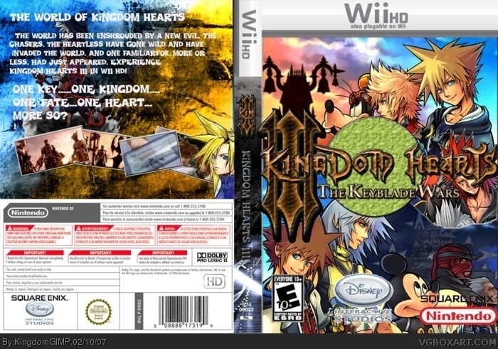
well, for one thing kingdom hearts on the wii? i dunno... nintendo logo wayy too big, square enix logo needs a white stroke, disney logo is badly cut out, green circle pretty much pointless, the front images dont meld together well, back image is weird and back font doesnt match.
#4, Dont be surprised if it comes, squares contract with sony ends soon. And for the box remove circle, make logo smaller and fix disney logo and i will vote, or your not planing to update to version 2
 Kingdom Hearts III Box Cover Comments
Enjoy! :D TOOK FOREVER! :D
[ Reply ]
CREDITS: Icarus_Flight for the template. Other credits shall be given later! :D
[ Reply ]
hey, I made the logo...remember that, all you did was edit it and added a effect...so give me credit , please ;)
anyway good job, but I don't like the back and the companies logos on the front are kind of hard to read (the nintendo one is ok)
4/5 for effort.
[ Reply ]
ehhh...
....
well, for one thing kingdom hearts on the wii? i dunno... nintendo logo wayy too big, square enix logo needs a white stroke, disney logo is badly cut out, green circle pretty much pointless, the front images dont meld together well, back image is weird and back font doesnt match.
[ Reply ]
Yup there's some big flaws but the box has character because it's vibrant and colorful.
So a 3.5/5 from me.
[ Reply ]
there shoulnt be a disney logo it should be buena vista games. it seems kinda crowded on the front.
4/5
[ Reply ]
#6 BVG change there companie's name to Disney Interactive Studios.
link
[ Reply ]
#7, ah, i didn't know. disney interactive studios sounds kinda lame.
[ Reply ]
I like this. it's a tad busy but well done :)
[ Reply ]
#8, haha yeah i agree they practically just went back to disney interactive...
[ Reply ]
#4, Dont be surprised if it comes, squares contract with sony ends soon. And for the box remove circle, make logo smaller and fix disney logo and i will vote, or your not planing to update to version 2
[ Reply ]
Good. They really are going to make Kingdom Hearts 3
[ Reply ]