if you look in full size you can see a white line around the pokemon on the front from cutting it out and i dont like the font color on the back, but other then that it's good
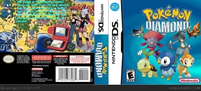
1) The BG from the back is a map of Kanto, what the hell does Kanto have to do with D/P?
2) The text is freaking hard to read.
3) And seriously...these are pasted together poorly.
 Pokemon Diamond Box Cover Comments
Do you think this is my best?
[ Reply ]
#1, Obviously, this is great! The only problem I noticed was the color of the text on the back. Other than that, it's most definately your best. 4/5
[ Reply ]
Nice! The back text is a little hard to read, but other than that it's great. Update and I'll give a 5/5
[ Reply ]
if you look in full size you can see a white line around the pokemon on the front from cutting it out and i dont like the font color on the back, but other then that it's good
[ Reply ]
#3, I cant change the color of the text on the back Ill have to start all over to do that.
[ Reply ]
Big improvment but the text need to better and you need a ESRB logo on the back actually have the contents (eg violence, language, etc) .
4/5
[ Reply ]
Why the hell do people actually like this?
1) The BG from the back is a map of Kanto, what the hell does Kanto have to do with D/P?
2) The text is freaking hard to read.
3) And seriously...these are pasted together poorly.
[ Reply ]