I've been working on this for 2 days and I am very pleased with how it turned out ! What do you guys think ? I hope that one day they will make a decent sequel to one of the greatest series.
Kick...Arsenal...
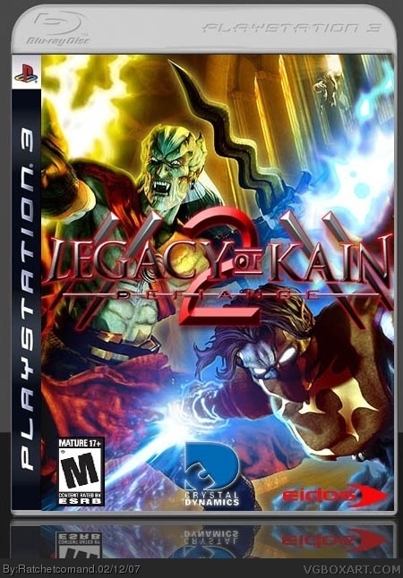
Really, though. Very nice. The logo seems to get lost in the main box though, unsure if it's fixable, seeing as how the box itself has a lot of colors and stuff.
Overall though, I like it, just fix that logo if you can. ;)
4.5/5
#3, i TOTALLY feel ya man, you have nice crisp text, and then you click submit, and BAM, its F'ed up, but anyway, like I said, 5/5. I just LOVE the realism, very official. The only thing i dont like are the eidos and M logo, but to me it doesnt distract from this box's obvious greatness.
Or some give me a 3/5 or lower post a comment and say '' Some give this a 3/5 or 2/5 or 1/5'' It kinda gets annoying without the edit feature for comments.
You got the glowing effects stright on. Even the CD logo works well with the image. The eidos logo however, doesn't seem to. Adding some extra stokes or glow effects may bring it out more.

 Legacy of Kain: Defiance 2 Box Cover Comments
Credit to PunisherAB for the Logo
Credit to HellKnight for his temp .
I've been working on this for 2 days and I am very pleased with how it turned out ! What do you guys think ? I hope that one day they will make a decent sequel to one of the greatest series.
Comments and votes are wecolme .
P.S It looks better in full view .
[ Reply ]
Kick...Arsenal...
Really, though. Very nice. The logo seems to get lost in the main box though, unsure if it's fixable, seeing as how the box itself has a lot of colors and stuff.
Overall though, I like it, just fix that logo if you can. ;)
4.5/5
[ Reply ]
sorry to double post and sorry for being a bit blurry, its the JPEG compression thats does that, it looks perfect in Photoshop .
[ Reply ]
#2, You post before me .
Thanks .
[ Reply ]
OMFG! This is how to make a box you damn n00bs/trolls!
5/5
[ Reply ]
#3, i TOTALLY feel ya man, you have nice crisp text, and then you click submit, and BAM, its F'ed up, but anyway, like I said, 5/5. I just LOVE the realism, very official. The only thing i dont like are the eidos and M logo, but to me it doesnt distract from this box's obvious greatness.
[ Reply ]
#5 and #6 Thanks (:
[ Reply ]
#6, I don't know what happen to the M and eidos logo , it look fine to me on Photoshop and the fourms .
[ Reply ]
#8, yeah, i noticed that too. strange...i get great quality rating logos from link
[ Reply ]
I upgrade it with a new ESRB .
[ Reply ]
#9, Wired , i get my ESRB from the wikipedia .
I fix it now .
[ Reply ]
UPGRADE I remove the outdergrow because i think the logo look better with out it.
Don't say it blurry because it look better in full view.
[ Reply ]
Nice work man...I you remembered to give credit, ya! ;)
Here's some advice. Next time, save as a .png then upload it. It will turn into a .jpg, but less fuzzy. Just look at my work.
Oh ya...5/5
[ Reply ]
#13, Thanks , i try saveing in a png it woun't upload for some reasson ?
[ Reply ]
Sorry bout the 4th upgrade , it woun't show up on my page .
I fix it now.
[ Reply ]
Thanks Guys (: If someone rated this 3/5 or lower tell me why and i fix it tommorw .
Sorry for the 3rd post.
[ Reply ]
Or some give me a 3/5 or lower post a comment and say '' Some give this a 3/5 or 2/5 or 1/5'' It kinda gets annoying without the edit feature for comments.
Sorry the 4th comment
[ Reply ]
You got the glowing effects stright on. Even the CD logo works well with the image. The eidos logo however, doesn't seem to. Adding some extra stokes or glow effects may bring it out more.
[ Reply ]
#18, Thanks for the comment , i can't fix it because my P.C is broken due to a virus .
[ Reply ]
#19, mmm viruses, always fun.
[ Reply ]
great box, how the hell missed it first time
[ Reply ]
Great box right there and thanks you very much for the feedback. :-)
[ Reply ]
#22, Thanks and your wecolme.
[ Reply ]