#5, Err no, this game has not been rated anything because it was cancelled and I gave it the same rating as all the other StarCraft games which is very appropriate.
Thanks for the comments anyways.
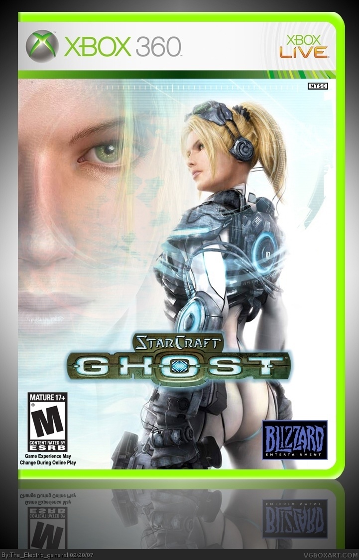
Ok I'll make the logo bigger as for the brightness, I want it exactly that way and it not's changing, the light is cool.
finalfantaseer try and use my wip for suggestions, they don't feel as supportive now.
#23, Do you have an issue. This is a great box, your the one who voted a 1 aren't you. Let's see you make one of your own boxes, instead of just stealing some.
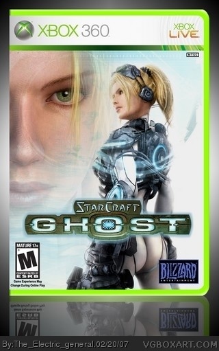
 StarCraft: Ghost Box Cover Comments
Oh wow that is hot! I think it's a good, 5/5! :D
[ Reply ]
I will vote in one second I am working on something, sorry for the double post! :D
[ Reply ]
Nice. Sleek, simple. I think the logo might be a LITTLE too small, in my opinion, but it looks great. 5/5
[ Reply ]
I don't know the rules of fighting, but I'm pretty sure one of them is to wear pants. :P
[ Reply ]
I was gonna use this pic similar to this one but o well .
This is very nice but it should be T not M.
4.5/5
[ Reply ]
#5, Err no, this game has not been rated anything because it was cancelled and I gave it the same rating as all the other StarCraft games which is very appropriate.
Thanks for the comments anyways.
[ Reply ]
* Typo, I meant StarCraft on the PC, I'm just saying I did my research.
[ Reply ]
I really like the scanlines and other effects you did with this. Very sci-fi feel to it. Nice job.
[ Reply ]
#8, Thanks.
[ Reply ]
i think it would look better with a bigger logo and i also think its a bit too dark, but its still nice.
[ Reply ]
#10, i meant its too bright, not "dark"
[ Reply ]
Ok I'll make the logo bigger as for the brightness, I want it exactly that way and it not's changing, the light is cool.
finalfantaseer try and use my wip for suggestions, they don't feel as supportive now.
[ Reply ]
As in the forums:
Wow...Awesome box.
At least that's what I think I said...
=/
[ Reply ]
#12. sorry.
[ Reply ]
#12, *WIP thread
*'Not's' is not a word, should've been it is.
#14, It's ok.
Made logo bigger, decided to make it a little bit darker after all.
[ Reply ]
Honestly, this game should not have been cancelled. It looked so great, and I had high hopes for it, but they crushed it with a single announcement.
Anyway, great box, looks exactly like what I hoped it would be. I call this box:
...Wait for it...
PERFECT! 5/5!
[ Reply ]
its looks better now
[ Reply ]
Thanks.
[ Reply ]
The only thing i dont like is that "home-made" light around logo
[ Reply ]
Houston, we have a Noob problem over. Someone give this a 1/5 .
[ Reply ]
I like it,my only problem is that the template seemds a bit bright to me...but whatever I like it 5/5 ;P
[ Reply ]
Why is something on my body rising upwards?
5/5.
[ Reply ]
too plain
[ Reply ]
#23, Do you have an issue. This is a great box, your the one who voted a 1 aren't you. Let's see you make one of your own boxes, instead of just stealing some.
Btw, 5/5.
[ Reply ]
I'd like the name of that girl.
[ Reply ]
#25 I think her name is Nova
[ Reply ]
#22, dont be a sicko
btw 5/5 +fav
[ Reply ]