Ugh, the upload made some things look bad. (EA logo)
Ok, bottom line:
Everybody uses reflections. So I wanted to play around with shadows for a change. I've been working on all this for a few days. I hope you like it.
im guessing it was the site that absolutely tortured the red color in teh burnout logo?
anyways, i dont like the placement of teh ea logo and teh e10+ logo should be a bit bigger
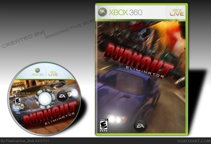
 Burnout: Eliminator Box Cover Comments
Ugh, the upload made some things look bad. (EA logo)
Ok, bottom line:
Everybody uses reflections. So I wanted to play around with shadows for a change. I've been working on all this for a few days. I hope you like it.
[ Reply ]
Nice boxart just need a NTSC logo .
[ Reply ]
I always forget that! :P
Thanks Ratchet.
[ Reply ]
Cool bob.
Do what #2 said and make the ESRB "E+10" logo on the front a little bigger. Then your do fine. :)
[ Reply ]
Thanks a lot Punisher. :)
But are you sure about the ESRB? On my screen it looks to be about a good size. =/
[ Reply ]
I forgot to give credit.
Thanks to Crayon Man for his 360 template,
and credit to Shady for his 360 disc template.
(sorry for double post)
[ Reply ]
it's looks small to me..for some reason..but I sitll suggust to make it a little bigger...the one on the CD is fine.
btw 4.5/5 for right now...5/5 for when you do a Update ;)
[ Reply ]
Thanks, dude.
It'll have to be a link to a Photobucket page, though. This was about 1.4MB so...Yeah...
[ Reply ]
link
Well...There ya go.
:P
[ Reply ]
im guessing it was the site that absolutely tortured the red color in teh burnout logo?
anyways, i dont like the placement of teh ea logo and teh e10+ logo should be a bit bigger
[ Reply ]
Are you talking about the box on the site, or in Photobucket?
[ Reply ]
I don't like the huge shadow Bob, not as slick as the rest.
Except that it's great.
[ Reply ]
Thanks General. I'll try playing around with the styles.
[ Reply ]
link
Added a reflection, and made the shadows less dense.
Hope you like it. :)
[ Reply ]