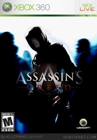
[ Box updated on March 10th, 2007 ] [ original ]
 Assassin's Creed Box Cover Comments
Comment on KILLERMIKE's Assassin's Creed Box Art / Cover.

[ Box updated on March 10th, 2007 ] [ original ]
Comment on KILLERMIKE's Assassin's Creed Box Art / Cover.
yes i know theres alot of boxes but i wanted to make it..and credit to google for everything
[ Reply ]
THIS IS COOL!!! 5/5 BUT HIS FACE LOOKS A LITTLE CHOPPU other than that cool!!!
[ Reply ]
phail.
[ Reply ]
i think this guy is muffinkiller
[ Reply ]
overused pic=phail
[ Reply ]
WHO IS MUFFINKILLER?
[ Reply ]
this is shit. All you did was darkened, and then lightened the face of an overused picture, and added les-fare to the logo. The ubisoft logo is also not official. How in hell does this deserve a perfect rating???? THIS deserves a perfect rating: link
[ Reply ]
you should never blend the logo's
[ Reply ]
Sorry KILLERMIKE but i don't like it.
1. What with the Ubisoft logo ?
2. I agree with Shadysaiyan don't blend the logo .
3. The pic is overused .
4. It to dark .
[ Reply ]
#7, YOU PURPOSELY LOOK AT ALL MY BOXES AND POST NOTHING BUT SWEAR WORDS#9ill be sure to change it when i get ready.i wanted the pic to look special.and i use gimp but i need to learn how to use the magic wand
[ Reply ]