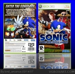
its without question your best sonic box. But those sharp white corners are really annoying in full view, and maybe im jut tired but that background blue looks little too strong
They're part of the template, which may or may not have been his fault. I prefer to give him the benefit of the doubt. If he had given the box a purely white background you would not have even been able to see them. As it is, I'm rating what's inside the template, not the outside.
its great.
however i have to be the tough critic that i am and pick out the little things that you could work on for the future, like the back information is blurry, the pal region logo is a little too big i think, and for teh reflection, only flip the box part, try not to include the background, because rigth now it looks like its transparent to white, and not to the background.
one of your best although i am not fond of the background image.
use crayonmans 2-sided on simple needs page6 of Simple Needs it looks like you just took out the 360 logo flipped it and posted the info from another temp
 Sonic the Hedgehog Box Cover Comments
i know i said no more sonic boxes, but with all this new material, i couldn't resist. i'm working on the two thrones, but i made this.
PLEASE look in full view.
[ Reply ]
There some white corners on the top of the boxart but it still great.
4/5
[ Reply ]
whoops, credit to crayon man for template.
[ Reply ]
I do believe this is your best box yet, Arcanus. Very, very nice job! 15/10!
[ Reply ]
its without question your best sonic box. But those sharp white corners are really annoying in full view, and maybe im jut tired but that background blue looks little too strong
[ Reply ]
Well, yeah, but you're grading him on the quality of the box, not the template and background. The box is great.
[ Reply ]
but those white corners are part of box
[ Reply ]
They're part of the template, which may or may not have been his fault. I prefer to give him the benefit of the doubt. If he had given the box a purely white background you would not have even been able to see them. As it is, I'm rating what's inside the template, not the outside.
[ Reply ]
whats wrong with you i already said that box is great but those 2 parts just ruins the whole experience. just trying to help
[ Reply ]
I see you finally used the art you begged sonic2kX for
awsome
[ Reply ]
wow i go for 2 minutes and 10 comments!
thanks a lot you guys.
and #10, remember that site? *wink wink*
[ Reply ]
its great.
however i have to be the tough critic that i am and pick out the little things that you could work on for the future, like the back information is blurry, the pal region logo is a little too big i think, and for teh reflection, only flip the box part, try not to include the background, because rigth now it looks like its transparent to white, and not to the background.
one of your best although i am not fond of the background image.
[ Reply ]
i didn't reflect the background, i don't know why it ended up like that.
[ Reply ]
#13, well, whatever happened... it doesnt look right.
plus the reflection is off center a few pixels.
[ Reply ]
use crayonmans 2-sided on simple needs page6 of Simple Needs it looks like you just took out the 360 logo flipped it and posted the info from another temp
[ Reply ]
that's what i did, crayon man's only has NSTC information stuff and i did a PAL box, so i had to modify it a bit.
[ Reply ]
oh I get it know
[ Reply ]
*now*
[ Reply ]