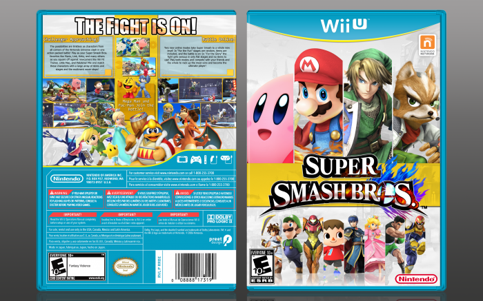
Haven't gotten this game for 3DS, but waiting it out for Wii U. I'm excited! Thank you to everyone who took the time to help me in my WIP thread, I really appreciate it.
So I based this off of UFC promotions and advertisements, and I think it turned out alright.
Thank you again ladies and gentlemen. Comments and feedback are appreciated. And as always, WALL-E is hiding!
Template - Martiniii332
[ Box updated on October 19th, 2014 ] [ original ]
 Super Smash Bros. Box Cover Comments
Comment on GameRoomProductions's Super Smash Bros. Box Art / Cover.

This box has so much wonderful chaotic power.
[ Reply ]
It's awesome.
The management of the characters and colors turned out nice.
[ Reply ]
Very nice :)
[ Reply ]
Looking pretty good! If It wasn't for you saying that you designed this on UFC designs, I would say the drab colour scheme detracts from the design, but I actually do like the idea now that I know what you where getting at.
The only thing I can really complain about is that the lighting on some of the characters is inconsistent to each other. Less so on the front, but i really notice it on the back, with DeDeDe and Rosalina. Looks a little off, I guess. Everything else looks great, though. You haven't lost your touch.
Also, Wall-E is in the bar code. :)
[ Reply ]
I wish I was that good.
[ Reply ]
it suppose be rated teen
[ Reply ]
Nope. It's supposed to be rated E10.
[ Reply ]
Oh snap.
[ Reply ]
I hate to say it (really, I do) but I am not too big of fan of this piece, and I can explain myself:
Firstly, I think it's just a little odd how the front top characters go over the yellow bar (or vice versa). It doesn't look right. The bar placement seems a little bit random, but I can see what you were accomplishing, so I'll leave it.
The Smash Ball under the logo, while it does add a little to it, makes it repetitive, because there is one replacing the "O" is "Bros."
The thin-line-separation motif on the bottom stretch of characters on the front works, but I think it's odd there are cut off characters sort of floating on the box. If you perhaps added a reflection to them, it would look better, in my opinion.
I personally think the drop shadows on the back characters make the whole back look "dirty," for lack of a better word. Also, I'm not sure whether it is my screen or not, but the desaturation doesn't seem fitting, especially when the front characters aren't as much. Generally, I'd add less drop shadow and maybe create my own, which would subsequently make the back look a little cleaner.
Good work over all, though. I just can't really like this one.
[ Reply ]
I must agree with Martinii here. While it's clear you've put a lot of work into this, there are still things to fix. I would also consider revising your font choice on the back (especially the tagline), because I feel it's what is letting down the back the most.
[ Reply ]
I agree with both of you, that's exactly what I would have put.
I'm not a big fan of the font, and the characters are way too grey
[ Reply ]
Thank you so much guys! This feedback is incredible and just what I needed! I'll be sure to make an update and work in my WIP thread, be sure to check it out when I've made some progress!
[ Reply ]
@GameRoomProductions will do :)
[ Reply ]
@TheTombRaider Thank you!
[ Reply ]