I've learn a trick pretty simple
And with that I made this...
View full
And leave a comment of what u think...:D
And credits to shiraizihaa for template
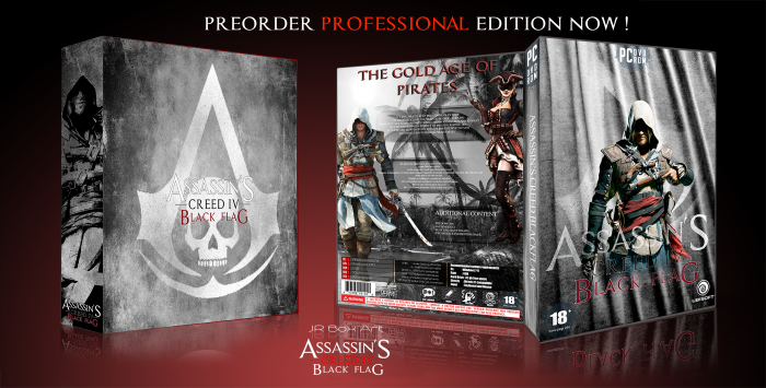
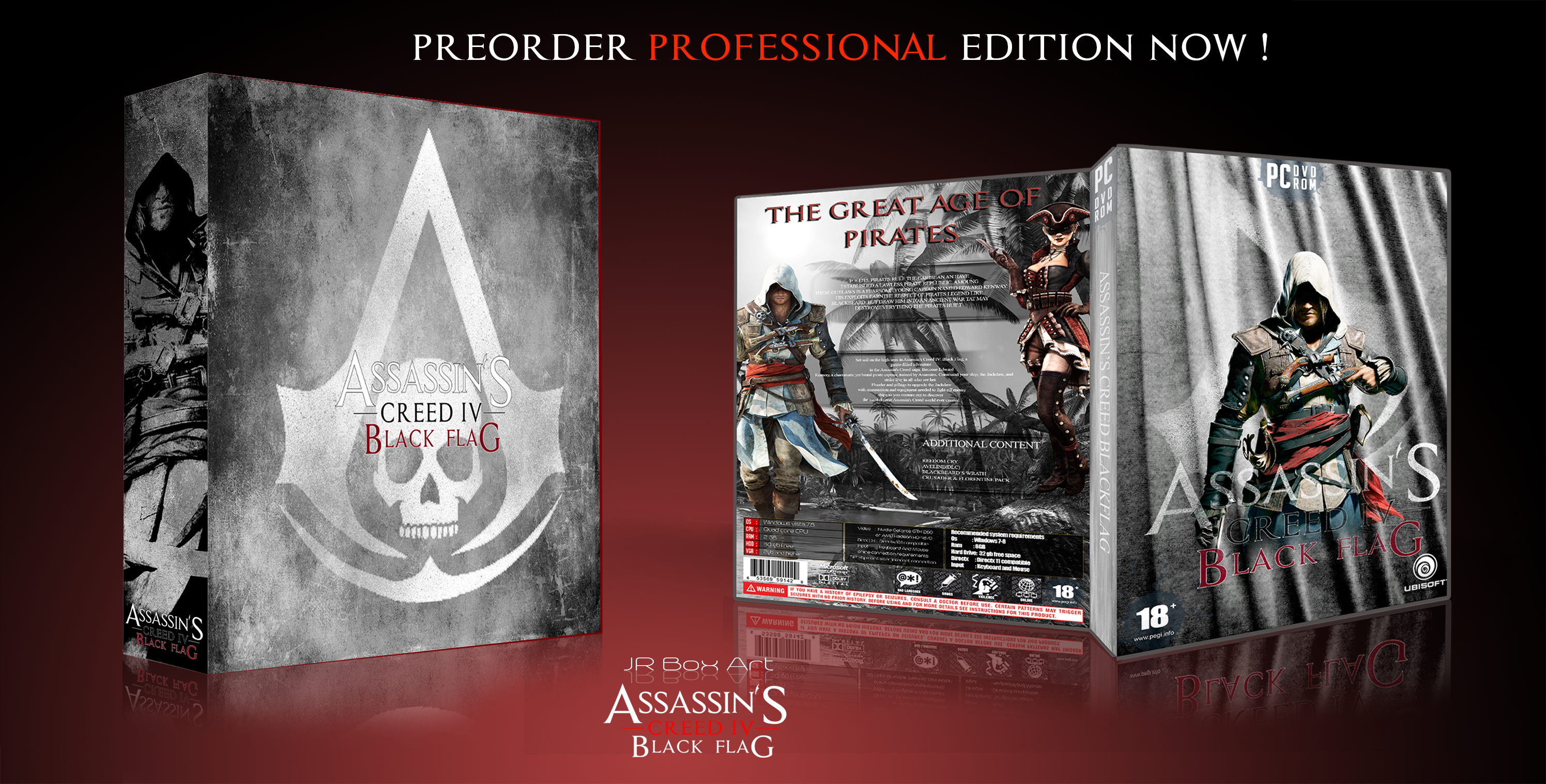
[ Box updated on October 14th, 2014 ] [ original ]
 assassin's creed blackflag Box Cover Comments
Comment on Jullrouu's assassin's creed blackflag Box Art / Cover.
Viewing in full size on a computer I would say maybe make the case on the right bigger and the box on left smaller. Seems you put more work into the case...
Other than that I love this design. You best work by far! Well done :)
[ Reply ]
Yeah.. Took like 5 - 6 hours. .and thank
[ Reply ]
At first I was impressed, but I really think that the colorful boxes you do look a lot better! This one is really nice, still there are a few things you should change: The Logos on the front are a bit distorted, as is the 'Great Age of Pirates' Tagline. You should fix that! ;)
[ Reply ]
OK aldimon...well I will fix that and keep Up with my colorful boxes :D
And thanks for the trick...:D
[ Reply ]
@Jullrouu no problem man, you can ask me anytime ;)
[ Reply ]
@aldimon I'm Agree With Aldi , So your back Covers are really good , But You Have To Spend More Time on Your Fronts , Totally Good Covers , Keep Up And More efforts . . .
[ Reply ]
@matingsm ok thanks.. :D
[ Reply ]
That Awesome.
[ Reply ]
Thanks Iman ...:D
[ Reply ]
Back is Good , But Front Not Good
[ Reply ]
I agree
[ Reply ]
@TheTombRaider OK I will try to fix that guys
[ Reply ]
WOW...very beautifull... good
[ Reply ]
Thanks..
[ Reply ]
awesome
[ Reply ]
Thanks
[ Reply ]
I like how this is put together and the textures used, but the text could use some fixing up. I feel like the header ("The Gold Age of Pirates") could be aligned left and place more to the left and down since that negative space around it currently is really driving my eyes crazy since it's so busy on the right side.
I'd also recommend fixing your text in the summary. Not sure why you capitalized one part and kept the other one normal? Capitalized paragraphs are hard to read since the shapes are all the same size and the human eye reads text based on the shape created by the negative space. I'd stick to typing it like normal—capitalizing the first letter of each starting sentence, etc.
The second part, that really long line of sentence in the middle of the second summary is distracting. The breaks overall in that paragraph are distracting. I'd stick to creating a bounding text box and keep the text in there as opposed to creating manual line breaks, which is overall what you seem to have done.
Also, there are a few typos here and there (missed letters, like the "F" in the word Freedom in the last paragraph. Speaking, of last paragraph, if you're listing the additional content like that, a bullet point of some sort would help it work better. Maybe bring in some of that red that you have throughout the box? Just an idea.
Sorry if my critque seems a bit harsh, I just see potential in the box since I really do like how it is laid out and what you did with the front especially. The slipcover is also pretty ace, I must say.
[ Reply ]