Hi
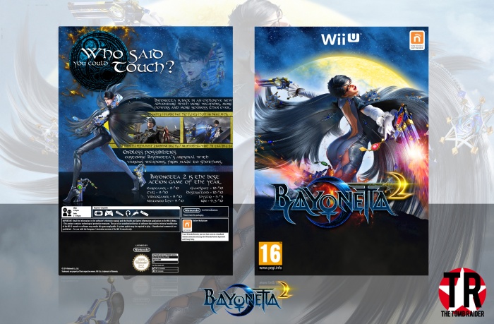
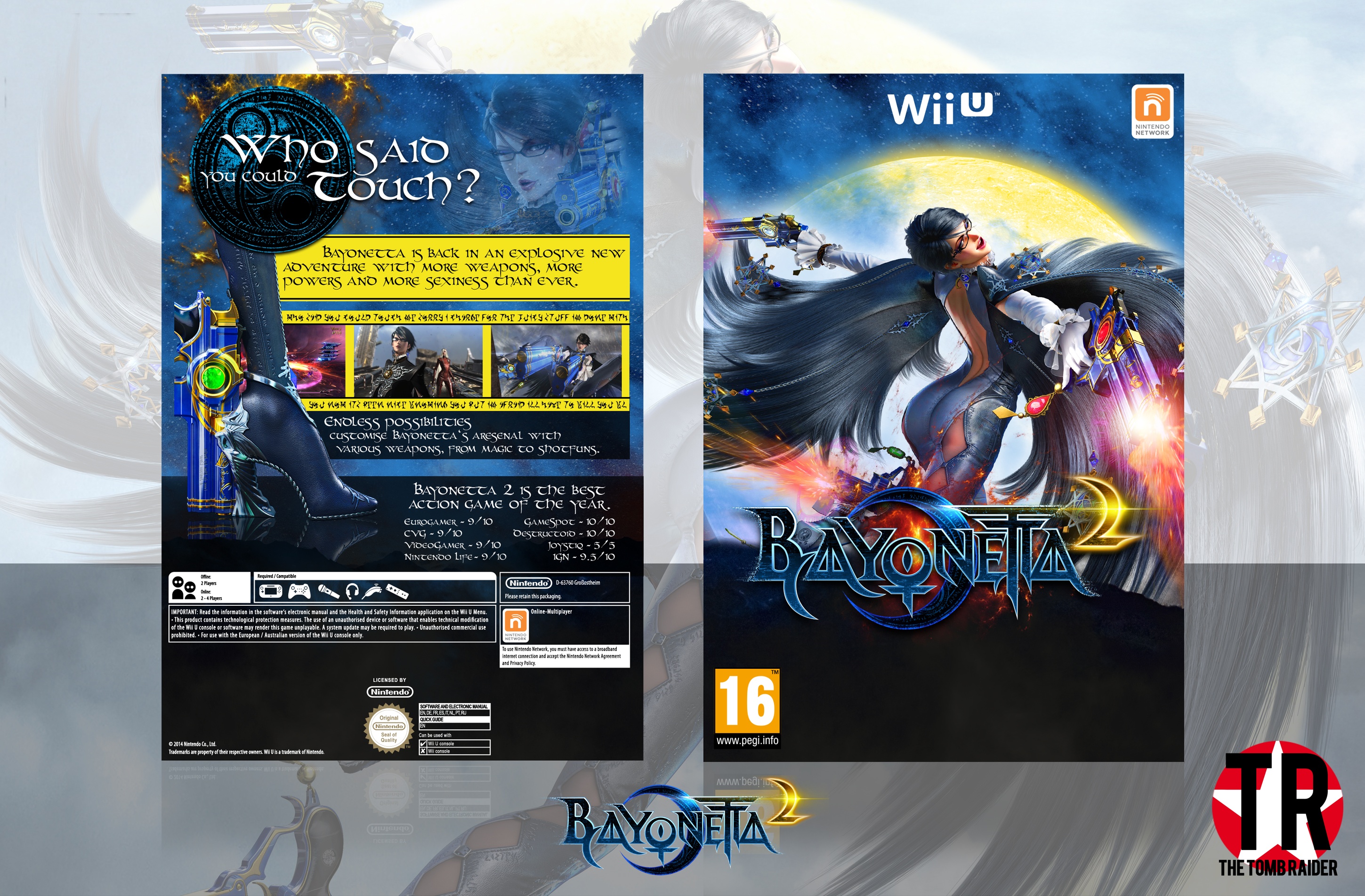
So I decided to make a Bayonetta 2 box
I think it came out pretty well, I was gonna post it in the WIP beforehand, but I already have my Zelda thread in there so I didn't bother.
Please view in full to see my update to the box!!
Please leave a rating out of 10 and some constructive criticism :)
[ Box updated on October 20th, 2014 ] [ original ]
 BAYONETTA 2 Box Cover Comments
Comment on TheTombRaider's BAYONETTA 2 Box Art / Cover.
This is borderline plaigarised from Higashi's.
[ Reply ]
I have never actually seen Higashi's Bayonetta box, but now that you've mentioned and I've gone to look at it they do strongly resemble each other. In an update I'll try and tweak it to make it look more original.
If Higashi sees this I'm sorry about that, I'll update it to make it look more original rather than a copy
[ Reply ]
@TheTombRaider no problem dude I don't mind too much about it, but I agree with your update idea.
[ Reply ]
@Higashi89
Ok, thanks for understanding :)
[ Reply ]
I really like it.
Although, i think you should a bit of a texture (not really strong, so that the text can still be readable) on the text boxes.
Other than that, cool. :)
[ Reply ]
Thanks, I'll include it in an update
[ Reply ]
Now that i'm looking at it better, I don't like that whole black thing on the front. Since you have that texture on the screenshots, I believe that you could implement it to the front and remove the black stuff, and bring the colors of that texture on the front.
[ Reply ]
@FrankBedbroken Ok, I'll try that, thanks Frank :)
[ Reply ]
UPDATE (already) - After seeing Higashi's Bayonetta box I insisted on changing mine, as I felt like mine was way too similar. It's only a minor change, but I think you can tell the 2 apart now...
I apologise if I annoyed anyone, I never intended on copying the other box :/
[ Reply ]
View in full for update
[ Reply ]
@iman pro I hope it does, thanks Iman :)
[ Reply ]
This is great, love the colour scheme. Looks very nice in full size
[ Reply ]
Thanks Vince :)
[ Reply ]
Even though I agree with FrankBedbroken, this is definitely very tasty.
[ Reply ]
Yep, it's yummy ;)
Thanks Jakob
[ Reply ]
Very Nice ;)
[ Reply ]
Thanks Amin, means a lot from you :)
[ Reply ]
The Whole Work Is Great, And Specialy The Back . . .
[ Reply ]
Thanks Matin :)
[ Reply ]
There is no publisher in the lower right, you've seemingly ignored the controllers section (I don't think you can use the microphone or wiimote/nunchuck) and I personally would have used the white bordered Pegi logo.
I really like the seemless blend of the cover and the console logo, it makes it a very unique but still very pretty design. colours work really well and nothing really feels out of place.
8/10
[ Reply ]
So forgot to change the Pegi border... I always forget publisher logos as well... But thanks for the kind words anyway :)
[ Reply ]
I don't know that game
but your design is awesome..
:D
[ Reply ]
9.9/10
[ Reply ]
@Jullrouu Wow, thank you so much!! :)
[ Reply ]
Looks pretty generic IMO.
[ Reply ]
Ok, I might be update it
[ Reply ]
This is awesome.
[ Reply ]
It is a bit bland however, and the text on the back could be different but I really like this.
[ Reply ]
@Pharaoh Thanks man ;)
[ Reply ]