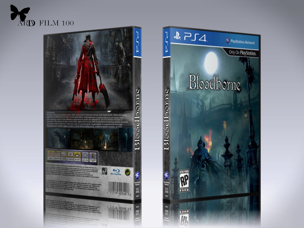
Looky definitely a lot better in 2D. Only thing I noticed is that some things are distorted, for example the 'RP'. Also, The synopsis has a weird font... you should use something that's more fitting to the game. Also: Never make it left-bound! Always make it block-bound or centered.
Those are the only flaws I notice. The reflection is a BIT too strong, maybe that. Apart from that, this is very damn nice, man!
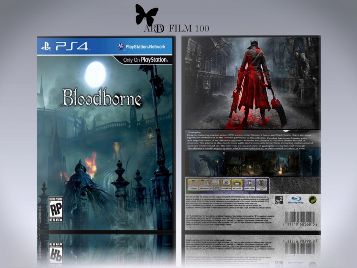
 BLOODBORNE ..... Box Cover Comments
I think this would look a lot better without the 3D my friend. :)
[ Reply ]
Was corrected
[ Reply ]
I agree, the 3D presentation looks a little off... the angle is weird :/
The actual box looks pretty good though
[ Reply ]
Good design.
I think this looks a bit strange because the case says ps4 but they aren't that big...
I feel like this should be a PC box...
[ Reply ]
Cover the mold off of the Web
[ Reply ]
Looky definitely a lot better in 2D. Only thing I noticed is that some things are distorted, for example the 'RP'. Also, The synopsis has a weird font... you should use something that's more fitting to the game. Also: Never make it left-bound! Always make it block-bound or centered.
Those are the only flaws I notice. The reflection is a BIT too strong, maybe that. Apart from that, this is very damn nice, man!
[ Reply ]