Hi
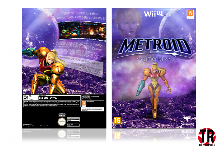
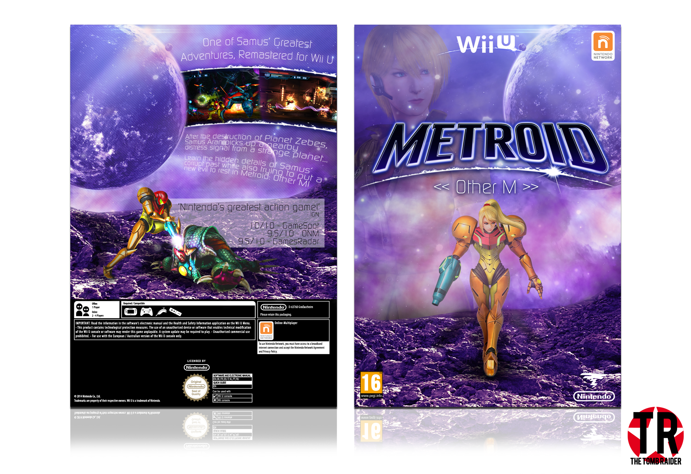
So if there's any Wii game I'd love to have re-made in HD for Wii U - it's Metroid: Other M.
Always been a fan of Metroid, so I decided to make this box for it.
Please leave opinions, constructive criticism, a rating out of 10 or just something....
[ Box updated on October 27th, 2014 ] [ original ]
 Metroid: Other M HD Box Cover Comments
Comment on TheTombRaider's Metroid: Other M HD Box Art / Cover.
Good timing to see this :) I just sent you an email about this but its very good
[ Reply ]
Oh I'll check it now, thanks Vince :)
[ Reply ]
Nice Colors ^-^
[ Reply ]
Thanks ^.^
[ Reply ]
It looks really nice. I love what you've done with the synopsis on the back, looks great. Love the colours as well, good work!
[ Reply ]
Thanks a lot!! :)
[ Reply ]
Very Nice Brother ;)
[ Reply ]
Thanks Amin :)
[ Reply ]
Try to be more original. It isn't cool to aalmost mimic other people's designs with your boxes. Your back is way too similar to sd1833's Metroid: Other M box back. Inspiration and mimicry are different dude.
[ Reply ]
I'm not mimicking boxes!!
I don't look at other boxes before I post mine!!
If you really insist that I change the back then I will, but the only thing that appears similar is the Samus render :/
[ Reply ]
@TheTombRaider it's almost impossible to believe that. It can't be a coincidence that you haven't seen my LoZ: Hyrule Warriors box before making yours, Higashi's Bayonetta 2, and sd1833's Metroid box. Pardon if you're serious but it's really hard to think you aren't mimicking.
[ Reply ]
... Your Hyrule Warriors box? How do our boxes even resemble each other?
As for the Bayonetta one and this box, I had never seen the others - I'm serious!! I updated my Bayonetta box because I felt bad for how much the backs resembled each other (coincidence, not copy) and I don't even see how you can say I've copied the other Metroid box! The only thing similar in our boxes is the render on the back, which I've updated. You can't hold that against me. Just because we used the same render doesn't mean I copied.
[ Reply ]
@TheTombRaider link
The similarities are pretty noticeable, if you ask me.
[ Reply ]
@Huegh
Even after my update?
If you view in full you'll see my change to the back
[ Reply ]
Updated the box...
I can't see it right now, don't know about you guys.
If you can't see it straight away, try viewing it in full because you can usually see updates first that way.
[ Reply ]
I like the colors, gotta agree with Martin though. Still, this is very good.
[ Reply ]
Why?? How does this resemble the other Metroid box?!
[ Reply ]
@TheTombRaider
Look at the back. link
It's quite obvious. I'm not saying you did it on purpose, but you changed things up now, which is good. Inspiration is good, but you shouldn't let yourself be too influenced by other box art covers, or else people will assume you try to copy them.
[ Reply ]
@aldimon
Do you still think they look too alike?? I've switched the Samus render and changed the quotes...
[ Reply ]
Looks Nice Job . . .
[ Reply ]
Thanks :)
[ Reply ]
I like this one. I would say the front is perfect as is and nothing really needs to be changed, except that her legs look a little weird. Maybe it's because it doesn't fully look like Samus is standing there.
As for the back, I think it looks good and not entirely too similar the other box in question. Yes, there are some similarities, but I don't believe there's any deliberate copying. However I'm not sure how I feel about the text on the back. Something appears off.
In the end, it all looks good, some minor improvements should make it look even better!
[ Reply ]
Thanks, finally someone who believes I haven't copied anyone's work
[ Reply ]
I like the purple colour scheme, I think it would look better without Samus blended in the top left. It would feel more isolated.
[ Reply ]
Thanks for the feedback :)
[ Reply ]