♥♥♥************
UPDATE
*********************
[ Box updated on February 21st, 2016 ] [ original ]
 Assassin's Creed Unity Box Cover Comments
Comment on *toptime*'s Assassin's Creed Unity Box Art / Cover.

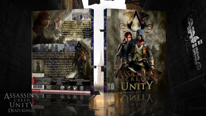
Logo in front are bad and make system requirement please , but back are very nice , I like this work , keep up your work dude ;D
[ Reply ]
thank you
[ Reply ]
This isnt your best, the logo on the front is very bad... Always keep pictures, logos etc in proportion. Also the text on the spine doesnt fit the game or this case... Finally the text on the back is also quite hard to read... This may be because the overall design is quite low res.
I can see the effort you put in though. Far Cry 4 is still your best
[ Reply ]
thanks . im fixin logo . you cant read text because resolution in low . ♥
[ Reply ]
FRONT FIX AND UPDATE
[ Reply ]
Really Much Better . . .
[ Reply ]
@matingsm
thanks
[ Reply ]
Nice.
[ Reply ]
thanks
[ Reply ]
Much better, I'm still not a fan of the spine though...
[ Reply ]
goooooooooooooooooooooooooooooooooood woooooooooooooooork my friend
[ Reply ]
Thanks bro
[ Reply ]
Not bad but a bit hard to follow all the text.
[ Reply ]
very nice
[ Reply ]
thanks
[ Reply ]