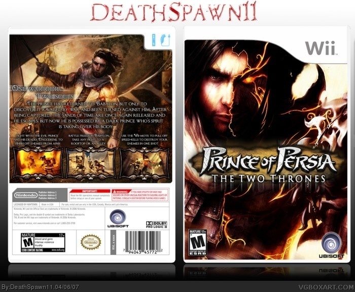
credit to Mist for the "Prince of Persia" part of the logo, and Crayon man for the temp. I don't want any shit about the Two Thrones not being on Wii. it was meant to be Rival swords but after cutting out the Two Thrones logo I'm not going to cut another PoP logo. nothing much else to say...... so enjoy :D
"Its not on Wii, so dont submit it, geez" J/K
Its cool. For once on the time that I have been hear. The front page looks like it is going to be flooded by good boxes. HOORAY!
I love it all EXCEPT for the logo. I don't mind that you put The Two Thrones on the Wii, but the cloud looks cut off around the edges. And I don't care too much for the subtitle reflection thingy...But it's an amazing box.
HOLY COW! This is GOOD STUFF! The back is just... excellent. I can see barely any flaws at all. Perhaps you could try making the description text bolder? 9/10
 Prince of Persia: the Two Thrones Box Cover Comments
Pretty cool...pretty cool
[ Reply ]
credit to Mist for the "Prince of Persia" part of the logo, and Crayon man for the temp. I don't want any shit about the Two Thrones not being on Wii. it was meant to be Rival swords but after cutting out the Two Thrones logo I'm not going to cut another PoP logo. nothing much else to say...... so enjoy :D
[ Reply ]
Nice. 10/10.
[ Reply ]
Seems like you've mastered back designs of box arts.
[ Reply ]
"Its not on Wii, so dont submit it, geez" J/K
Its cool. For once on the time that I have been hear. The front page looks like it is going to be flooded by good boxes. HOORAY!
[ Reply ]
#5, It's what to be expected from the Easter holidays.
[ Reply ]
i love the text on the back.
nice box overall
[ Reply ]
#6, Dude, I was joking.
[ Reply ]
#8, doode, he was talking about the boxes overflowing.
[ Reply ]
I love it all EXCEPT for the logo. I don't mind that you put The Two Thrones on the Wii, but the cloud looks cut off around the edges. And I don't care too much for the subtitle reflection thingy...But it's an amazing box.
[ Reply ]
#9, Dewd, oh. He should have made that more clear.
[ Reply ]
Yeah because it's all my fault you misinterpreted something. :(
[ Reply ]
i agree with 10, you shouldve just faded the sandy edges like
link or link
[ Reply ]
#12, It is ok. I forgive you.
[ Reply ]
hey man you should be a boxmaker later very nice 5/5
[ Reply ]
#15, What does that mean exactly?
[ Reply ]
#16, it means I should design boxes for game companies later in life.
[ Reply ]
#17,
[ Reply ]
#17, PFFT... like that will ever happen. That is like a snowman's chance to survive in the middle of a blizzard. Those are the odds.
[ Reply ]
#17, and waste a yo-yo master's talent? i think not!
[ Reply ]
#20, Woo, that was funny.
[ Reply ]
The temps bad. Read on the back beside the nintendo logo to see why.
[ Reply ]
9.5/10
[ Reply ]
HOLY COW! This is GOOD STUFF! The back is just... excellent. I can see barely any flaws at all. Perhaps you could try making the description text bolder? 9/10
[ Reply ]
This awesome but the game is rated T not M link 5/5
[ Reply ]
#25, no it aint link
maybe youre thinking he did rival swords. but he didnt.
[ Reply ]
#26, agreed. I have this game (Two Towers), for my Xbox, and it is most definately rated M.
[ Reply ]
#26, Sorry i must miss read the title .
[ Reply ]
#28, it's okay. No big deal.
Ratchet.
Comand.
Just.
Got.
Owned.
j/k
[ Reply ]
#27, two TOWERS??? BAHAHAHA
pikachu
just
owned
himself.
loser.
[ Reply ]
#30, dammit. I was thinking about PoP, but typed LotR.
Pikachu.
Just.
Got.
Owned.
[ Reply ]
why do my boxes always get this?
[ Reply ]
Let's get back on topic about this box. It is stellar. 5/5.
[ Reply ]
Can you please make printable?
[ Reply ]