So yes, this one doesn't fit the "typical" style of an official box. But I made it the way I wanted my box to look. Because this game really struck me as an old-school game. It reminded me a lot of old PS1 games. I even considered putting in a jewel case. Either way, I'm really happy with what I made.
 Monster Hunter 4: Ultimate Box Cover Comments
Comment on K_D's Monster Hunter 4: Ultimate Box Art / Cover.
Nice work, a damn shame the official logo sucks so much it kinda distracts from the design on the front.
[ Reply ]
Damn, that looks great! Really nice work! ;)
[ Reply ]
Yes, looking good
[ Reply ]
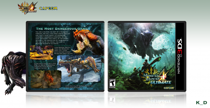
This looks really great, minus a few renders being kind of low-resolution (specifically, that one screenshot on the back). I think it's cause resources are a bit limited?
I really like the structure on the back.
[ Reply ]
Actually, everything I used was much higher resolution than what I needed. Except for that one screenshot. The resources are limit, but that was the fun part.
[ Reply ]
I like how this is packed well with content and looks good. Nice work.
[ Reply ]
Nice
[ Reply ]
Great work.
[ Reply ]
Ooh, I like this. The front has a sense of urgency and movement and the back is simple, but looks good. The lack of legal info was a good choice, don't think I'd like this as much if it was there.
[ Reply ]
I would like to hear constructive criticism, if you have ideas for how I could improve it.
[ Reply ]
Nice work
[ Reply ]
Very nice. I personally think the logo could've been on the left side of the front cover where that empty space is, I don't know if it would be better or not though.
I like the different think you have going on for the back but IMO there's a tad too much text. "New Game Mechanics" and after is a lil bit much, but the screenshot arrangement helps it.
[ Reply ]
Yeah, it's a bit crowded. I was modeling it after some PC game backs that I liked, and of course they're much longer, so it wasn't so crowded there. You're probably right about the logo, though. I'll see how that looks.
[ Reply ]
Hey man nice box
[ Reply ]
Very cute design. I'm a fan of the game and I mean that I love this job. It is very clean and quite colorful. The effects of the front cover left me speechless. The back also has its charm, but the front cover surprised me more. good job ! ;)
[ Reply ]
Lovely
[ Reply ]
Never played the game, but this looks awesome !
As someone who likes when boxes look official, the fact that there is no legal doesn't even bother me here
[ Reply ]
This is way over the top
_
/(|
( :
__\ \ _____
(____) `|
(____)| |
(____).__|
(___)__.|_____
[ Reply ]