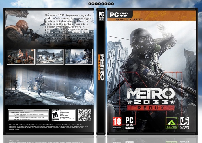
This couyd be better, keep logos, picturs etc in proportion. Dont stretch them or else it makes the design look strange.
The back cover seems very basic, with not much on it... Try adding a heading, maybe in a similar font and colour to the logo. This might make things a bit more punchy
The cover looks very boring, there is much inspiration note. Are different logos METRO presented, I think is not good. I do not notice much effort or desire on the back cover and it looks very empty. but you can improve this and more elegant presentation will be worth taken into account.
 metro 2033: redux Box Cover Comments
Much Better From Previous Box.Keep Going Soldier :)
[ Reply ]
This couyd be better, keep logos, picturs etc in proportion. Dont stretch them or else it makes the design look strange.
The back cover seems very basic, with not much on it... Try adding a heading, maybe in a similar font and colour to the logo. This might make things a bit more punchy
[ Reply ]
This ... and I love your template , and 3D version is better , over all not bad
[ Reply ]
nice work
[ Reply ]
The cover looks very boring, there is much inspiration note. Are different logos METRO presented, I think is not good. I do not notice much effort or desire on the back cover and it looks very empty. but you can improve this and more elegant presentation will be worth taken into account.
[ Reply ]