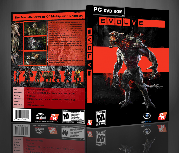
I do not like. Honestly all the work is blurry when displayed in full screen. Besides being very incomplete. Renders common, and view screenshots, a single source, and the front cover is boring. Sorry, could have been good but overall not a good job.
VVV give him a little credit sheesh. None of what you said was advice to maybe help him along. Anyways I think it's a nice box. Remove that red box on the front cover. Just have the monster on front and make it simple.
For the front, maybe get rid of the red block. Or personally I would just try and blend the monster in to the darkness more. Try adding some shadows on the legs etc...
Try finding some higher quality pictures to use in the fututre. This will make it look better.
The back.... there is too much text in a single block. Try to split it up a bit and that will make it easier on the eyes.
I dont think all the little "Evolve" logos and the little monster renders are needed next to the screenshots. Maybe get rid of some of the character renders to make more room. So you can make a monster render bigger?
 Evolve Box Cover Comments
I do not like. Honestly all the work is blurry when displayed in full screen. Besides being very incomplete. Renders common, and view screenshots, a single source, and the front cover is boring. Sorry, could have been good but overall not a good job.
[ Reply ]
ok
[ Reply ]
VVV give him a little credit sheesh. None of what you said was advice to maybe help him along. Anyways I think it's a nice box. Remove that red box on the front cover. Just have the monster on front and make it simple.
[ Reply ]
thanks
[ Reply ]
For your first case this isnt that bad....
For the front, maybe get rid of the red block. Or personally I would just try and blend the monster in to the darkness more. Try adding some shadows on the legs etc...
Try finding some higher quality pictures to use in the fututre. This will make it look better.
The back.... there is too much text in a single block. Try to split it up a bit and that will make it easier on the eyes.
I dont think all the little "Evolve" logos and the little monster renders are needed next to the screenshots. Maybe get rid of some of the character renders to make more room. So you can make a monster render bigger?
[ Reply ]
thanks
[ Reply ]
i am not agree with warsony
[ Reply ]
thanks
[ Reply ]
So did you make the back cover?
link
link
[ Reply ]
printable pls
[ Reply ]