I was messing around with some ideas for my Evolve case and ended up making a full case XD.
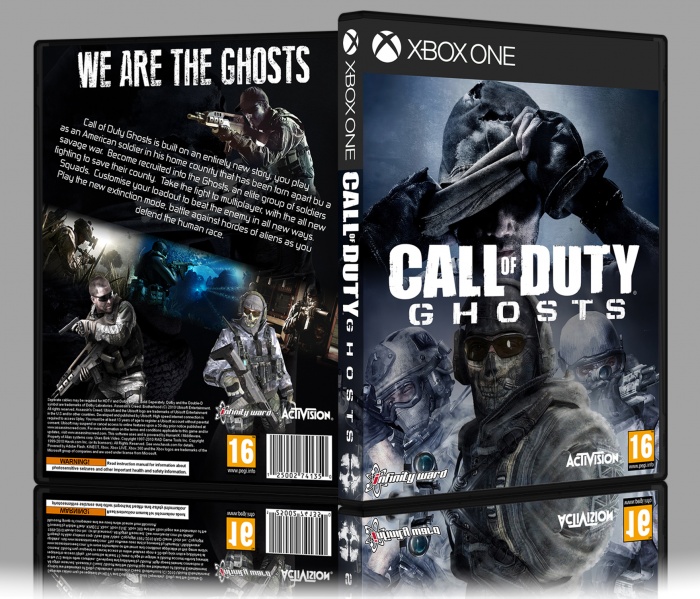
[ Box updated on March 3rd, 2015 ] [ original ]
 Call of Duty Ghosts Box Cover Comments
Comment on AlternationHD's Call of Duty Ghosts Box Art / Cover.
Front is better, however the infinity ward and Activision logos are too big. Have a look how small they are on official covers. I probably do them a bit smaller than that.
The back again is better than your last box. But still needs improving, it's very basic. The main text looks very jumbled about. Try and have more alignment with text. Lastly have a look for a way to display the screenshots in a more interesting way.
will give you a fav for your effort.
[ Reply ]
Cheers Vince, I really appreciate the time you put into helping me improve.
[ Reply ]
@AlternationHD no worries man :)
[ Reply ]
@AlternationHD Looks better on the update :)
[ Reply ]
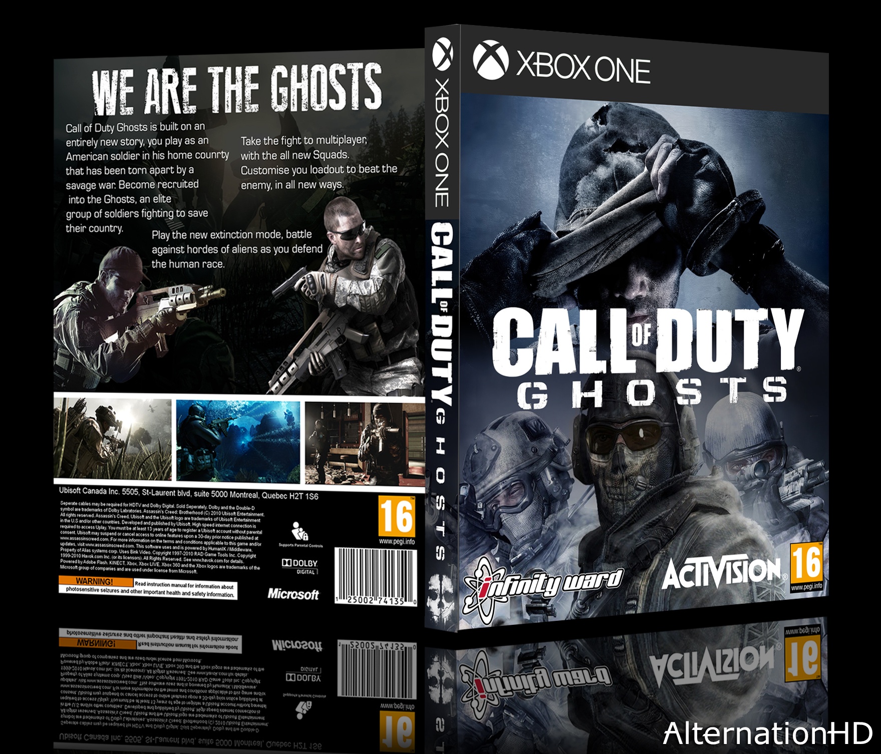
sorry man your back no good but front is nice
[ Reply ]
Thanks, the back is being re-done. It was a test gone wrong :P
[ Reply ]
work harder my friend
[ Reply ]
i will :)
[ Reply ]
Design updated, thanks for all your help :D
[ Reply ]
OOOOH NICE AND DIFFERENT
[ Reply ]
Thanks :)
[ Reply ]