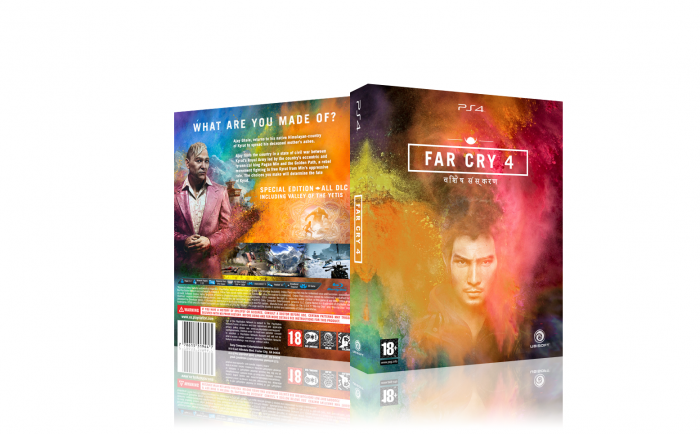
I love some design elements Ubisoft used in Far Cry 4, such as the powder and the typographic elements when you enter a new area. So I decided to use those elements to make a box for the game.
It's a special edition, but the Nepali text on the front said that already, so I'm sure you already knew that.
Please fav and comment, thanks for watching!
 Far Cry 4 Box Cover Comments
Comment on That Mr Awesome's Far Cry 4 Box Art / Cover.
Woah, interesting idea and pretty good execution. Cool job, Mr. Awesome! :)
[ Reply ]
Thanks Frank!
[ Reply ]
Nice job colour are so cool
[ Reply ]
Thank you
[ Reply ]
Excelent
[ Reply ]
Thanks HB!
[ Reply ]
Very different. I really like it, it's gorgeous. Love the colours. Only gripe I have is I think the render on the back clashes with everything else.
[ Reply ]
Thanks a lot. Personally I thought it blended well, with those splatters. I'll take another look at it and see if I can make it better. Thanks for your comment :)
[ Reply ]
You like this better? link I'm not sure about it.
[ Reply ]
@That Mr Awesome i like it either way....
[ Reply ]
nice color
[ Reply ]
Thanks Iman!
[ Reply ]
NIce work dude. Love it
[ Reply ]
Thanks a lot
[ Reply ]
Love it. Really captures the essence and art style of FC4. Good work!
[ Reply ]
Thanks! And yeah, that art direction of the game is beautiful. It screamed for a box like this :)
[ Reply ]
i like your color
nice
[ Reply ]
I was wondering if you would like it ajay ;) Thank you!
[ Reply ]
I like the colours makes it look super interesting, really awesome design, I do think the front would maybe look better if the guy was desaturated alot, I think it'd make the colours pop more, either way good job man.
[ Reply ]
very nice
[ Reply ]
Different taste , good job , :")
[ Reply ]
Great theme, very fitting to the game.
[ Reply ]
Colorful and pretty!
[ Reply ]
Love this one!! But no printable download? :((
[ Reply ]
printable please
[ Reply ]