[ Box updated on April 11th, 2007 ] [ original ]
 Prince of Persia: The Two Thrones Box Cover Comments
Comment on thecodemaster's Prince of Persia: The Two Thrones Box Art / Cover.
[ Box updated on April 11th, 2007 ] [ original ]
Comment on thecodemaster's Prince of Persia: The Two Thrones Box Art / Cover.
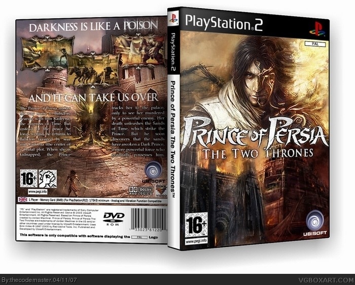
I think this may well be my best box ever.
But I'll let you decide.
[ Reply ]
very nice, my only complaint is that the pictures take some realism away, I really don't think they had cameras back then o_O. 4.5/5 until you fix the screens.
[ Reply ]
They did, they just didn't know what they were for :)
[ Reply ]
the pictures look like photographic evidence used for interrogations... but this box is flippin' sweet.
[ Reply ]
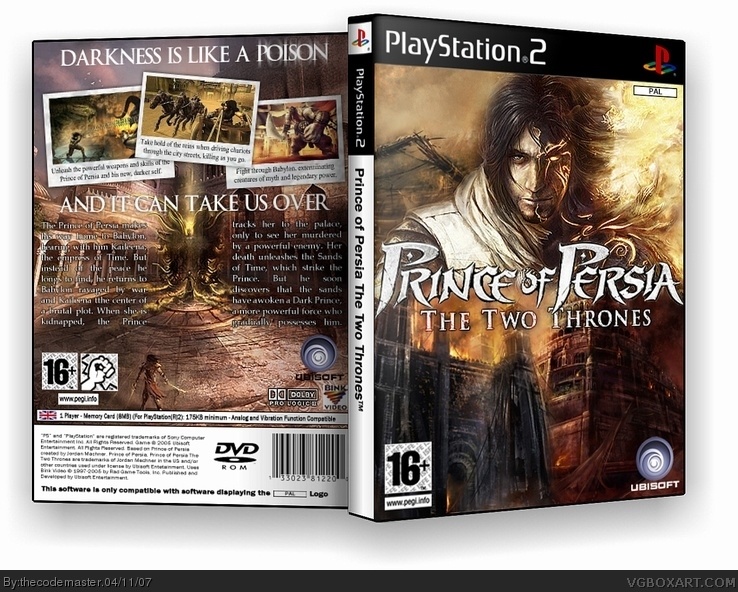
*Updated to Version 2*
No more photographs, frames instead! Although, on the back of the REAL Two Thrones box, it has photo-like screenshot displays. I have it. Right in front of me now.
Come on, people, I need more comments!
[ Reply ]
cool
[ Reply ]
holy crap, this is fuckin' nice.
5/5
[ Reply ]
Awesome 5/5
[ Reply ]
i like the frames alot better.
a fine, fine box, i really like what you did with "poison"
and you made the box look different frem others, even thought you used common image.
i dont like how the title logo is touching the sides, but besides that, a great box.
you betta keep it up!
[ Reply ]
Thanks [#9] - The actual Prince image I used, although common, is still slightly different, because the "dark side" of him is on fire. On the others, he's not. Secondly, the logo only touches the sides to try and hide the blending from the Prince image to the concept art below.
[ Reply ]
Except for the little, unreadable letters in the back, everything is perfect! Good Job!
[ Reply ]
man so nice 5/5 nothing to say about this :D
btw i have a question could you tell me how you do the thing around your picture
[ Reply ]
not the temp but i dont know how it is called in english... the thing that replace your photo-like thing
man sorry for all those "thing" but i dont know how to say it
[ Reply ]
The frames around the screenshots on the back cover? If so, they're actually off the official Prince of Persia website, I just took the other images out of them.
[ Reply ]
ok thanks its frames the words i was searching :P thx really much man
[ Reply ]
Heh, no problem.
Oh, and [#11] - The text is small. I agree. But the weird thing is, I've got the offi box in front of me, holding it in my hands, and the text is really small. We always complain about it here on VGB, but actually all it is the perspective of the image and the slightly less sharp quality than reality. So yeah, it really does just LOOK too small.
[ Reply ]
love the front but the back needs work.
[ Reply ]
#17, Do you want a slap? This is three years old.
[ Reply ]