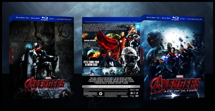
This looks great! Front is superb and the only nitpicks I can think of to improve it is adding actors names at the top to make it more official feeling and having the caped guy in the background above Hulk's head be removed completely or made completely visible. The back is great as well but there are a few issues I have with it. I'm not sure the summary text should be all caps and the text wrapping on the right is a little awkward. Play around with it to see if you can get it to flow better. Take the indent off "Don Hall" in the special features, and maybe consider a different image of Captain America, he's not really in any sort of action pose and he looks like he's taken from a screencap compared to the others, that can probably slide if you can't find anything better but the text could definitely be formatted a little better.
The slip cover or whatever it is on the left probably isnt needed since it's just a fan poster with the logo on it that doesn't really flow with the rest of the box but I don't think it matters much if you keep it or ditch it.
It's a solid boxart and it's almost there, just fix those tiny things and it'll be excellent!
 Avengers: Age Of Ultron Box Cover Comments
This looks great! Front is superb and the only nitpicks I can think of to improve it is adding actors names at the top to make it more official feeling and having the caped guy in the background above Hulk's head be removed completely or made completely visible. The back is great as well but there are a few issues I have with it. I'm not sure the summary text should be all caps and the text wrapping on the right is a little awkward. Play around with it to see if you can get it to flow better. Take the indent off "Don Hall" in the special features, and maybe consider a different image of Captain America, he's not really in any sort of action pose and he looks like he's taken from a screencap compared to the others, that can probably slide if you can't find anything better but the text could definitely be formatted a little better.
The slip cover or whatever it is on the left probably isnt needed since it's just a fan poster with the logo on it that doesn't really flow with the rest of the box but I don't think it matters much if you keep it or ditch it.
It's a solid boxart and it's almost there, just fix those tiny things and it'll be excellent!
[ Reply ]
Not good shirazihaa your previous box was much better than this.
I mean this link & this link go & try darder.
[ Reply ]
I like it. Front cover I think is the best
[ Reply ]