![]() »
»
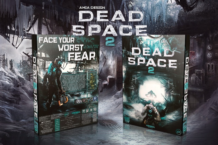
Hi every one , Hope U’re passing your time good , here it is Dead Space 2 , never did a cover for this series , so this one was a lot fun .
Front is mixed of several pics and renders ,
The idea of back I mean texts and suit status and screenshots took from this screenshot link
Thanks to all who helped me finish this box . <3
Resources :
Front : link
Back : link
Thank U all for viewing . :”)
 Dead Space 2 Box Cover Comments
Comment on amia's Dead Space 2 Box Art / Cover.
oh man this is amazing.
[ Reply ]
Thank U :")
[ Reply ]
I quite like this. The whole cold feel the box gives is pretty well pulled off, and the composition is very good. Very good job, Ali. :)
[ Reply ]
yup , wanted to give it a different taste , thank U dude :")
[ Reply ]
Wow cool work
[ Reply ]
Very nice :) I do prefer this without the extra character render on the 3d and the back looks much better
[ Reply ]
Thanks to U, :")
[ Reply ]
That's nice, the way u chose to put texts and screenshots is great, also I can see what u done with the front, really great job Ali . . .
[ Reply ]
U like it? Thanks :")
[ Reply ]
Amazing ali . Like it ;)
[ Reply ]
Not like yours, thank U :")
[ Reply ]
Like it ! :)
[ Reply ]
Glad to hear that :")
[ Reply ]
Amazing box Ali, love the blue colour scheme you have running throughout the design :)
[ Reply ]
Thanks, that wasn't pure blue, the original background of front and back in behind 3D presentation, :")
[ Reply ]
this is pretty damn slick, the only nitpick I can think of is that the presentation (esp. the big logo) takes away from the box itself imo. but seriously, top notch stuff
[ Reply ]
I'm Glad u like it, the logo, I'll get rid of that big logo, thanks for tip :")
[ Reply ]
this is very goooood amia .
[ Reply ]
:")
[ Reply ]
It looks really good, but I think the whole style and the artworks in the background would rather fit to Dead Space 3.
[ Reply ]
It doesn't matter, it's important that it fits the box itself, anyway. Thank U. :")
[ Reply ]
Very cool design!
[ Reply ]
Nice job Ali ...
[ Reply ]
Printable?
[ Reply ]
Congrats Ali, Very well deserved . . .
[ Reply ]
Congrats Ali ;)
[ Reply ]
Congratulations man
[ Reply ]
Congrats Ali! :)
[ Reply ]
Very nice. I like the colors and character placement. A suggestion would be to get rid of the drop shadow of the character on the front. I mean he has a shadow on the ground and then another one on the light behind him.
[ Reply ]
aaaaa, that's true , didn't see that , thanks for noticing me , ;")
[ Reply ]
thanks guys :")
[ Reply ]
Is unexplainable
Extremely nice
[ Reply ]