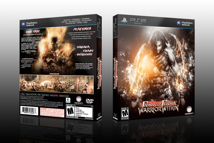
Hey Guys
This is my 10th box And i want to share my this box experience for all of you
Thanks
[ Box updated on March 31st, 2016 ] [ original ]
 Prince of Persia: Warrior Within Box Cover Comments
Comment on edward91's Prince of Persia: Warrior Within Box Art / Cover.

Is this meant to be both games in one? Or just a concept...
I feel it should have both logos and seem more like 2 games in one . As it is now i feel this is for Warrior Within, and you have mistankenly put "and Thrones" on the title name.. I know the dark prince is on the back, but that does say to me this is a collection...
From a design side, this is really nice, i love the dark and bright clashing colours. I much prefer the front too. On the back I am not sure if the word "screenshots" is necessary as people know they are looking at screenshots
[ Reply ]
thanks vince
[ Reply ]
Nice
[ Reply ]
Thanks sp
[ Reply ]
again nice color
[ Reply ]
Thanks kelle
[ Reply ]
Good Box.
[ Reply ]
Thanks dark s
[ Reply ]
I'm not sure about the back layout :/ the text on there seems to be all over the place, I'd cut it down a bit. Give it some blank space on the left section and re-position the text in the right lower corner (maybe move it up a bit or lower the tagline above it?)
Your front covers on the other hand still look very slick, the last time I've checked ;)
[ Reply ]
p.s. I'd also suggest to use more basic fonts for the main text and some bolder/fancier text for the headers. This way it gets much easier to read the text and keeps them separated from one another.
[ Reply ]
@Bastart
thanks man for feedback
[ Reply ]
Diviene :D
[ Reply ]
Thanks
[ Reply ]
You Are Beyond Designer
[ Reply ]
No I'm not
But I love designing
[ Reply ]