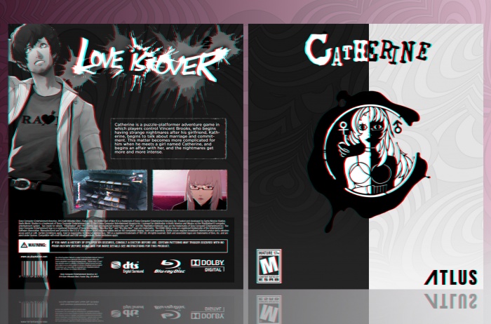
I looked over the WIP thread time and time again but whatever feedback I would've given had already been said. I really like how this has turned out. As Frank said, the 3D effect is much better now. My only small criticism would be I think you need more white on the back to match with the front, as it's 50B/50W on the front but more like 80B/20W on the back. But this is only minor, overall, great job :)
The box is very well done. I agree with the disproportion regarding the black and white colors, but not a major problem, considering the white is located as the color fill for the text, logos (like the bluray, DTS logos) tagline "Love is Over" and Vincent himself. Overall, not a major problem to me.
I think the image on the front cover could be bigger, since it would take more empty space.
 Catherine Box Cover Comments
I quite like the simple yet interesting design, and the 3d-ish effect looks much better than what I saw on the WiP the first time. Good job. :)
[ Reply ]
I looked over the WIP thread time and time again but whatever feedback I would've given had already been said. I really like how this has turned out. As Frank said, the 3D effect is much better now. My only small criticism would be I think you need more white on the back to match with the front, as it's 50B/50W on the front but more like 80B/20W on the back. But this is only minor, overall, great job :)
[ Reply ]
I love this! Well done man
[ Reply ]
The box is very well done. I agree with the disproportion regarding the black and white colors, but not a major problem, considering the white is located as the color fill for the text, logos (like the bluray, DTS logos) tagline "Love is Over" and Vincent himself. Overall, not a major problem to me.
I think the image on the front cover could be bigger, since it would take more empty space.
[ Reply ]
Love it
[ Reply ]
I'm blowing away...
[ Reply ]
grab onto something then
[ Reply ]
Where can I download it
[ Reply ]