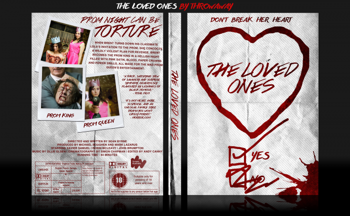
Something I whipped up whilst working on another box. Feedback is appreciated as always.
[ Box updated on January 3rd, 2016 ] [ original ]
 The Loved Ones Box Cover Comments
Comment on Throwaway's The Loved Ones Box Art / Cover.

This looks like a movie I would hate. Nice box, though. Simplistic yet appealing. My only suggestion would be to use a different font for the synopsis and legal text, something like an Helvetica or Futura should do the trick. Aside from that, good box. :)
[ Reply ]
It's definitely not for everyone, that's for sure. The black humour redeems it though. And thanks for the feedback, I was wary of using anything other than a script-type font in case it ruined the overall look, but I may try those fonts and update it if I think they work better :)
[ Reply ]
Yeah I agree with this. The fact that the same font is used throughout the entire case makes it feel a little repetitive. Nonetheless, it's a really creative design and I like it a lot!
[ Reply ]
Updated it (finally) with a different font for the synopsis and legal info. Kept the quotes the same font as I felt the handwritten effect for them makes more sense, and it separates them from the synopsis. Thanks for the feedback!
[ Reply ]
Nice front but I think back can be edited by removing text and make some artwork there
Nice imagination though
[ Reply ]