![]() »
»
Full View Printable here: link
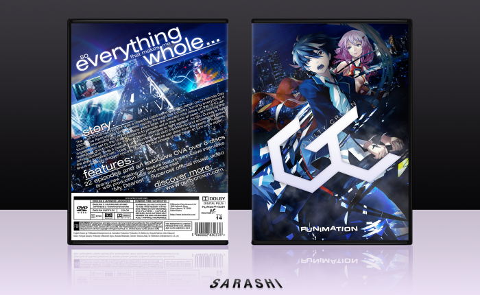
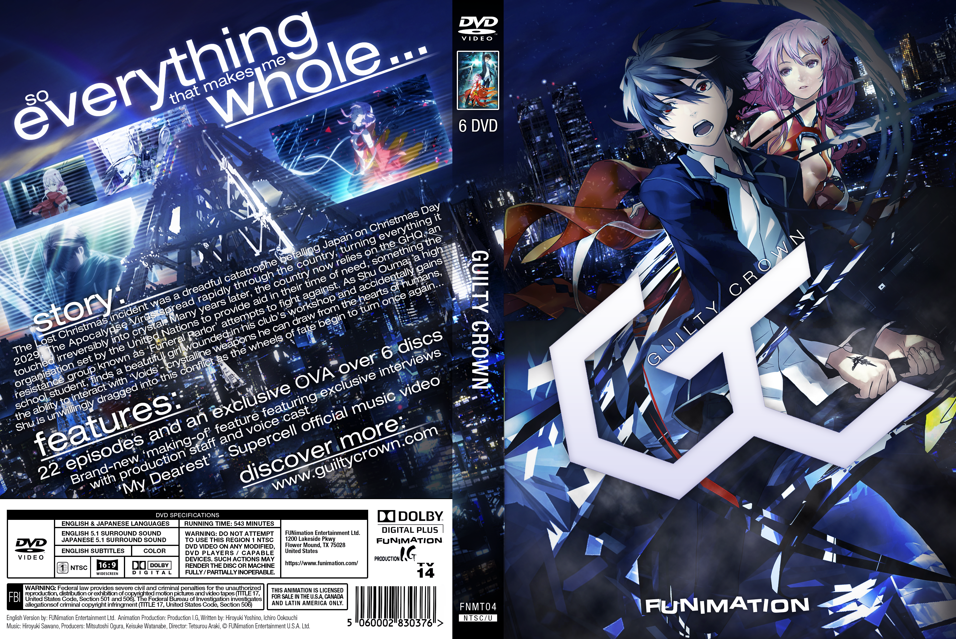
So it turns out that I've been on this site for 7 years a couple hours ago. Time sure flies, but rest assured, my boxarting skills have been, are, and always will be subpar. Decided to do another anime box; for whatever reason the mood struck me to make one (and also I remembered how long I spent making the template). I decided to make everything at an angle, but I'm not sure how it turned out. Probably going to get destroyed by picking an anime that the majority of people who watched hated, but never mind.
Credit to Eggboy'13 for the template, even though he claims it's not his.
 Guilty Crown Box Cover Comments
Comment on Sarashi's Guilty Crown Box Art / Cover.
Just wow
[ Reply ]
If your boxarting skills are subpar, then that doesn't get reflected on your designs at all, cause they look great! The back's a bit textheavy but other than that, it looks stellar. Great job, Sara, and happy 7 years on the site! :D
[ Reply ]
Wow, that's impressive! Love this anime.
[ Reply ]
As Frank has said the text on the back is a little bit too much, But this is way better than Subpar in my opinion. Love that angled tagline btw.
[ Reply ]
Love it, really awesome work Shi. You putting this into kickstart?
[ Reply ]
No, not really- it's not a kickstart kinda box if you know what I mean.
[ Reply ]
@Sarashi Fair enough, I still think this is wicked.
[ Reply ]
PerrrrrrrrrrrrrrrrrrFect
[ Reply ]
This is intense. So many things going on on the back and front covers. Nice going with the diagonal orientation approach
[ Reply ]
I'm not into Anime, but I like the colors and the futuristic look of the box.
On a more constructive note though, I've stumbled on some minor issues with the typography. The readability in some places on the synopsis could be improved, the text size could be a bit smaller so it creates more blank space around it and the taglines could be more in line with the logo on the front.
[ Reply ]
OK, thanks for the feedback. I'll look into what I can do about it on a personal and technical perspective, but I'm not 100% sure the update feature works so I don't really want to break it on the site.
[ Reply ]
Amazing! One gripe though, there's too much text on the back - it's a sore on the eyes but other than that, great!
[ Reply ]
It's a fair comment to be honest. There is too much text but it kinda looked plain without it, but I can understand.
[ Reply ]
congrats Sarashi
[ Reply ]
Congrats Sarashi, this is really well deserved.
[ Reply ]
Yeaaaaaah congratz!
[ Reply ]
Congrats, Sarashi!
[ Reply ]
Congrats sarashi
[ Reply ]
Congratulations
[ Reply ]
I like my presentation best on this box. I reckon I'll stick with it.
[ Reply ]