I deleted my earlier attempt.
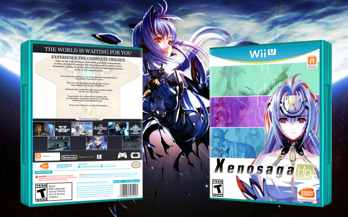
This time, I distorted the image to fit a new case template and made a back. It is nothing special, but I'm proud of it. If you have any critiques have at them.
 Xenosaga HD Box Cover Comments
Comment on Wexter0079's Xenosaga HD Box Art / Cover.
Not Bad
[ Reply ]
Thanks man.
[ Reply ]
I like the front, but I think the back could look better if you implemented some of the colors on the front onto it, it looks a bit faded out at the moment in comparison to the front. That said, not bad at all. Welcome to the site, and if you ever need help on the next designs you make, make a thread on the Works in Progress section of the forums so you can get suggestions as to how you could make it better. :)
[ Reply ]
Thanks! The back was really hard to think of a way to make it work. Since each Xenosaga game uses a different art style from the other I had to scratch my original idea of using the 2D character art. Now that I think of it, I should of used the faded gold for the outlines on the grey boxes instead of the lighter grey.
As for the front it was a ton of fun to do! I had to remake the original covers as they did not work with the new Zohar line art I made. Overall I do think the front is the real standout.
PS: If I do decide to make a new cover I will make sure to use the forums so I can get some feedback. :)
[ Reply ]
I really agree with Frank this. However for your first case this is pretty good man, keep it up. Ps welcome to vg
[ Reply ]