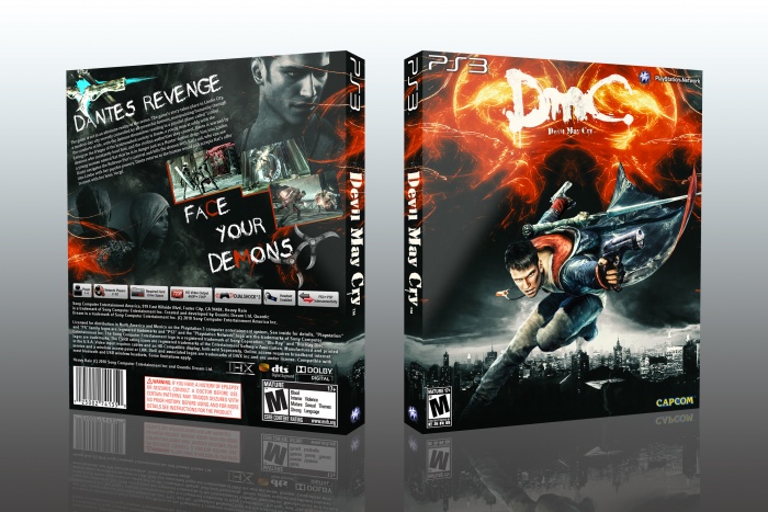
I like the overall look of the box, especially the color scheme. I'd like to give you some minor pointers though.
The synopsis is a bit to close to the edge of the box (give it a bit more breathing space around it, by moving it more to the right) The renders on the left corner could be a tad brighter i know you tried to align the header with the screens, but the space next to it feels a bit empty by doing so (i'd suggest to try overlapping the image a bit to the left and see how that might turn out)
 DMC: Devil May Cry Box Cover Comments
excellent!
[ Reply ]
Thanks
[ Reply ]
very good
[ Reply ]
Thanks
[ Reply ]
I have only one word for this work ................perfect
[ Reply ]
Thanks
[ Reply ]
Perfect...
I Like It
[ Reply ]
Thanks
[ Reply ]
Very nice work ;)
[ Reply ]
Thanks
[ Reply ]
nice :)
[ Reply ]
Thanks
[ Reply ]
welcome back
nice work
[ Reply ]
Thanks
[ Reply ]
I like the overall look of the box, especially the color scheme. I'd like to give you some minor pointers though.
The synopsis is a bit to close to the edge of the box (give it a bit more breathing space around it, by moving it more to the right) The renders on the left corner could be a tad brighter i know you tried to align the header with the screens, but the space next to it feels a bit empty by doing so (i'd suggest to try overlapping the image a bit to the left and see how that might turn out)
[ Reply ]
Thanks for help bastart I'm soon fix and
Update the box
[ Reply ]
nice work edward
[ Reply ]
Thanks Vince
[ Reply ]
Congrats!
[ Reply ]
Thanks man
[ Reply ]
Congrats man) well deserved!
[ Reply ]
Thanks Dante
[ Reply ]
Congrats man, well done
[ Reply ]
Thanks
[ Reply ]
This looks very uninspired. It's technically well-made, but reeks of boring by-the-numbers design.
[ Reply ]
Thanks for comments
[ Reply ]
Congrats Edward
[ Reply ]