This is actually pretty good! But the back of it seems a bit dark, don't you think? But that was just an opinion. That's the only thing I see a bit wrong about this box. It's like comparing 1 point to billion. So it looks like I have no other choice but to give you a 5/5. Keep up the great work.
Does your PS ever make the picture go darker slightly when you press something accidently? I think I discovered, it changes the colour from RGB 16 to RGB 8.
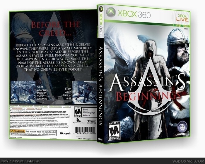
 Assassin's Beginnings Box Cover Comments
Newest box. Was going to be my competition box but Ratchet left me. I thought this was my best.
[ Reply ]
PS, the site killed the color. Here is the real version:
link
[ Reply ]
great job i like it.
[ Reply ]
#3, Thank you.
[ Reply ]
This is actually pretty good! But the back of it seems a bit dark, don't you think? But that was just an opinion. That's the only thing I see a bit wrong about this box. It's like comparing 1 point to billion. So it looks like I have no other choice but to give you a 5/5. Keep up the great work.
[ Reply ]
#5, Yeah, I made it a little to dark I think also. I should have lighteened up the main back pic. But thank you!
[ Reply ]
Does your PS ever make the picture go darker slightly when you press something accidently? I think I discovered, it changes the colour from RGB 16 to RGB 8.
Nice box, by the way.
[ Reply ]
#7, Yes and I hate that. Thanks also.
[ Reply ]
looks awesome, but the back description seems like you are repeating "the assassins are well known" lots of times. make it more interesting.
still, this box kicks ass.
[ Reply ]
#9, I thought of that back in like 2 seconds.
[ Reply ]
I like this alot, fav'd
[ Reply ]