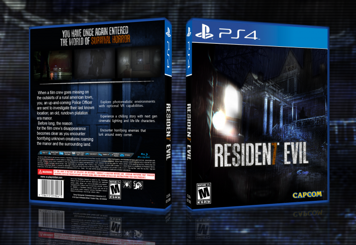
You have once again entered the world of survival horror...
Completely restarted from scratch. New logo, new (heavily edited) background, and
an entirely new back. In the last couple of days I found out just how hard it is to edit a
daytime photo to look like night.
Images Used:
1) link
2) link
3) link
4) link
5) link
Screenshots are from the official Resident Evil 7 website.
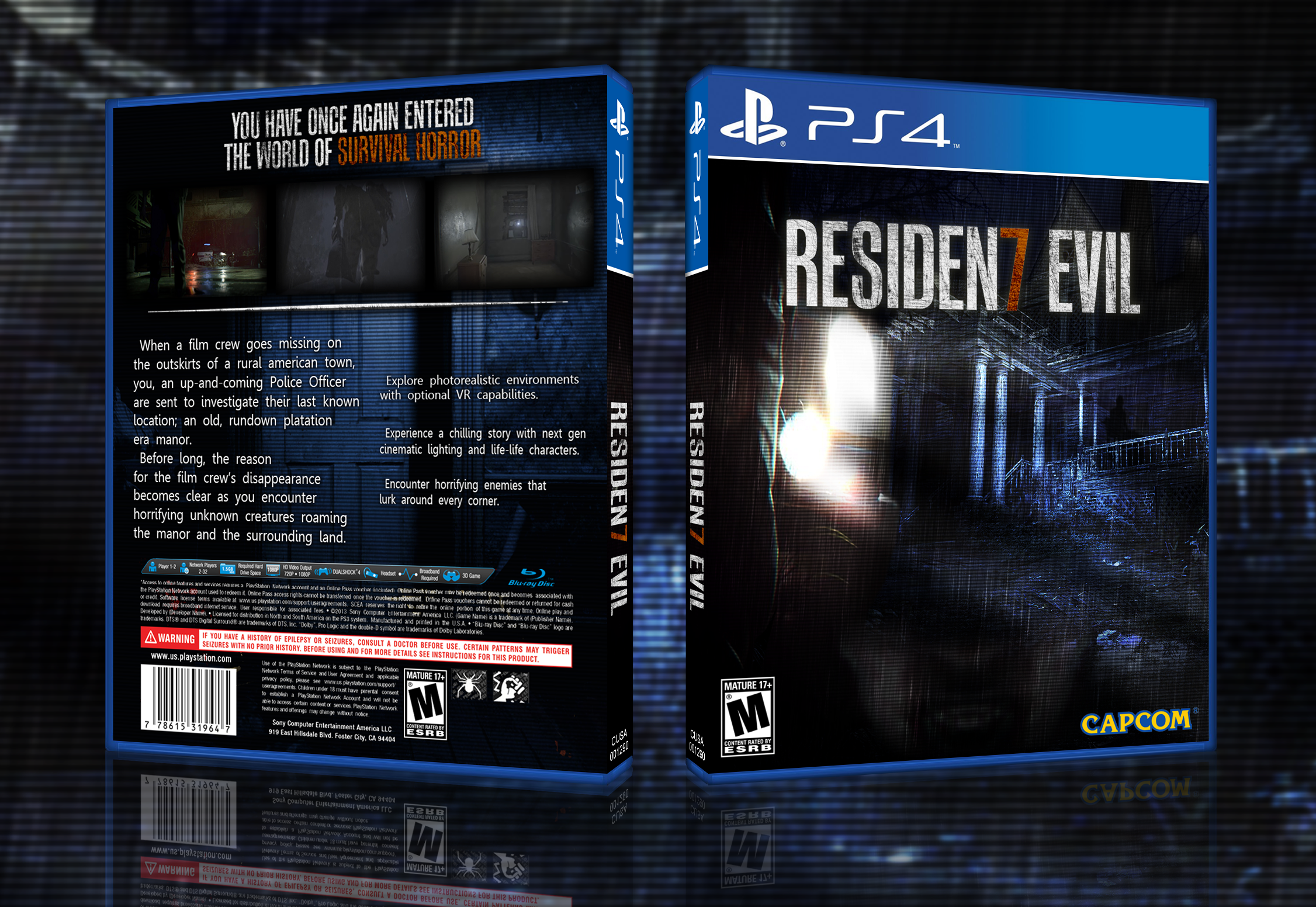
[ Box updated on June 22nd, 2016 ] [ original ]
 Resident Evil 7 Box Cover Comments
Comment on JengaSoft's Resident Evil 7 Box Art / Cover.
I like it! Major improvements over the last one!
[ Reply ]
Interesting alternative logo but I personally like the official one more, I don't think seven is a number thta fits the hole of the letter T very well. The japanese logo "Biohazard" makes the seven appear inside the letter z, and it fits perfectly!
The box is all right, since the resources for this game is lackable.
[ Reply ]
I wanted to make it more unique, which is why I went with the new logo. The whole number as a letter in a title thing (I.E; SPE3D, SCRE4M, F.3.A.R ect.) came from leet speak or "1337" speak, in which the '7' is often used to replace the 'T' for example; "Wh47 7h3 h311 m8 n0 h8!" (not that I ever talk like that) which is why I went with that design choice.
[ Reply ]
@JengaSoft I see your point and I appreciate your creativity
[ Reply ]
residenseven evil
[ Reply ]
better than resident evii.
[ Reply ]
biohasevenard
[ Reply ]
SpeThreeD, F.Three.A.R, FiveNal Destination
[ Reply ]