![]() »
»
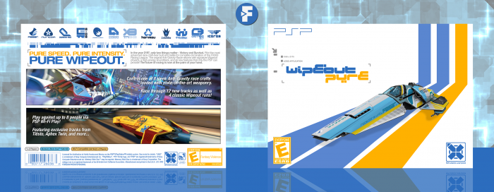
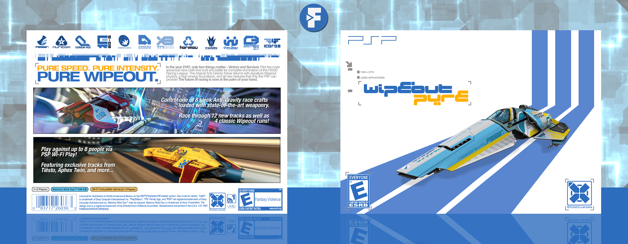
New box!
I've been wanting to do a box for Wipeout for a while now, seeing as I really like racing games and futuristic aesthetics, and I had this on progress for a few months, so I just recently finished the structure of it to a somewhat final state. The front's kinda generic and boring in my opinion, but I really don't know what else to do with it, so if you have any suggestions as to what could I add, be sure to let me know.
As always, constructive criticism is welcome, and huge thanks to Matknapers18 and Higashi89 for their help and feedback on the forums, it's greatly appreciated. Also, credits go out to o0DemonBoy0o on deviantArt for the model on the front, check his stuff here: link and to Titan38 for the ESRB ratings.
Hope you guys like it! :)
[ Box updated on July 10th, 2016 ] [ original ]
 Wipeout Pure Box Cover Comments
Comment on FrankBedbroken's Wipeout Pure Box Art / Cover.
its goood!!!!
[ Reply ]
hey
that's pretty good!
[ Reply ]
sexy back
[ Reply ]
I'm bringing sexy back
Them other boys don't know how to act
I think your special whats behind your back
So turn around and ill pick up the slack.
[ Reply ]
Looks great! I personally think the ESRB on the front would look good yellow, but it still looks really nice.
[ Reply ]
Thanks, Nathan! I tried that out, but it looked off in my opinion. I can try it again and see how it looks, though. :D
[ Reply ]
Looks great! I personally would have liked a splash of more yellow on the front (maybe one of the streaks, like the farthest right one? I think the brackets on the publisher logo and the ESRB on the front is not quite necessary. It feels more so lost on the ESRB one, but I can see why the publisher logo has it in order to balance out there logo.
The back is very sexy. I like the way you treated the top half.
[ Reply ]
Thanks, lucid! Definitely will look into fixing these in the next update. :D
[ Reply ]
honestly think this is your best box to date franco, really good shit.
[ Reply ]
I'm personally not sure about that, but either way, thanks, KierAn! :D
[ Reply ]
came out lookin mighty fine, nice job frank
[ Reply ]
Thanks, Mat! :D
[ Reply ]
The back looks great and although the front is a bit simple, it still fits in with the style of the game (some transparent buildings/structures in the left top corner, could give it more depth and fill in the blank space)
I don't know how I feel about the ESRB ratings in the faded blue though :/
[ Reply ]
Thanks, Bastart! Will look into it when I update it! :D
[ Reply ]
Congrats man
[ Reply ]
Thanks, man! :D
[ Reply ]
it got louder!
you couldn't tame this energy inside!
[ Reply ]
Awesome work Frank, congrats!
[ Reply ]
Thanks, Vince! :D
[ Reply ]
Congrats~ also like the update. :)
[ Reply ]
Thanks, lucid! :D
[ Reply ]
Awesome job!! I Love the Wipeout series...i wish they'd make a new one!
[ Reply ]
Thanks, UV! I would for sure love a new one as well! :D
[ Reply ]
Nice, especially the back layout.
[ Reply ]
Thanks, man! :D
[ Reply ]