eh... i hate wrestling...
the sunburst looks horrible. dont put it on top of the template or logos.
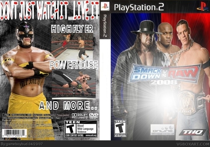
and watch the heavy outline on the text, nothing on the spine?
if i voted, i'd give this a 2/5 if i was in a generous mood.
AND DONT TYPE IN CAPS YOU SOUND MENTALLY RETARDED.
Good design man, i give it a 4\5, i'm a big fan of wwe games and programs and anyone who makes the boxes that are decent looking will get high praise from me! the only thing i can suggest on yours is to make your sunspot a little less glared and to use a different catch-phrase on the back something like, "Be the wrestler...Become a Hall of Famer" or something like that!
wow im sorry but i totally disagree with the comment above me. this is nothing like a 4/5 maybe a 2.5/5. the catch phrase is the same as one of the other years, the 1st picture is from last years, and the second picture is from WWE RAW from 2001
 WWE SmackDown! vs RAW 2008 Box Cover Comments
CREDIT TO SOCKYMEOW FOR THE TEMPLATE. ANTHER SVR 2008 BOX BY ME. COMMENT AND GIVE ME ANY TIPS IF NEEDED.
[ Reply ]
eh... i hate wrestling...
the sunburst looks horrible. dont put it on top of the template or logos.
and watch the heavy outline on the text, nothing on the spine?
if i voted, i'd give this a 2/5 if i was in a generous mood.
AND DONT TYPE IN CAPS YOU SOUND MENTALLY RETARDED.
[ Reply ]
ok you dont have to go crazy on me
[ Reply ]
#2, you can hear him? ok.
[ Reply ]
im going with everything #2 said.
[ Reply ]
U CANT USE THE SAME SLOGAN AS LAST YEAR (DNT JUST WATCH IT LIVE IT) TEMPLATE COULD BE A LITTLE BIGGER AND MIDDLE OF SUNBURST A LITTLE SMALLER
[ Reply ]
#2, hehe, how do you "sound" retarded in terms of text?
I dun hate wrestling games (tho I dun care for the actual "sport"). I actually enjoy them.
But yeah your sunglare is WAY TO MUCH! Other than that it's just plain. Also, if it's a PS3 title, it should be a PS3 box, not PS2.
[ Reply ]
THe Shine on the box makes the title on the box hard to see
[ Reply ]
its for the PS2 also.
[ Reply ]
Good design man, i give it a 4\5, i'm a big fan of wwe games and programs and anyone who makes the boxes that are decent looking will get high praise from me! the only thing i can suggest on yours is to make your sunspot a little less glared and to use a different catch-phrase on the back something like, "Be the wrestler...Become a Hall of Famer" or something like that!
[ Reply ]
wow im sorry but i totally disagree with the comment above me. this is nothing like a 4/5 maybe a 2.5/5. the catch phrase is the same as one of the other years, the 1st picture is from last years, and the second picture is from WWE RAW from 2001
[ Reply ]
Come on mann WTF!! 2/5
[ Reply ]
1.5/5
Ewww...
[ Reply ]